The Continuous Evidence Generation Protocol: Two-Stage Validation (RWE → Pragmatic Trials)
Treatments that could save lives take an average of 8.2 years (95% CI: 4.85 years-11.5 years) to complete clinical trials after discovery. Since 1962, these delays have contributed to an estimated 102 million preventable deaths. Meanwhile, only 1-10% of adverse drug events get reported to the FDA, and billions of people generate continuous health data through wearables and apps that remains unharvested.
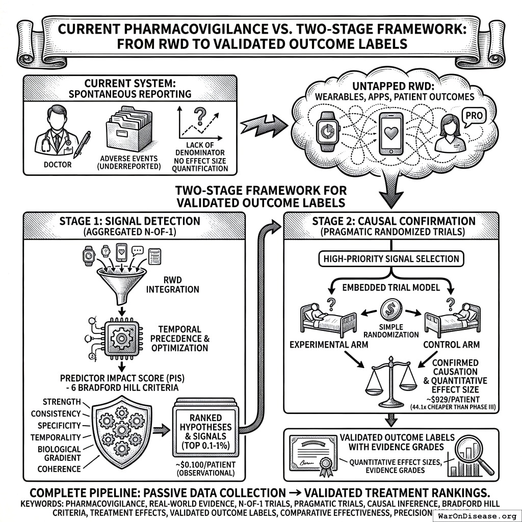
We present a two-stage framework that transforms this data into validated treatment recommendations. Stage 1 ($0.1 (95% CI: $0.03-$1)/patient): aggregate millions of natural experiments and score causal confidence using the Predictor Impact Score (PIS), a composite metric operationalizing six Bradford Hill causality criteria. Stage 2 ($929 (95% CI: $97-$3,000)/patient): confirm top signals through pragmatic trials embedded in routine care, 44.1x (95% CI: 39.4x-89.1x) cheaper than traditional Phase III trials. Cost estimates derive from a meta-analysis of 108 pragmatic trials plus implementations like RECOVERY (which found a life-saving treatment in 100 days) and ADAPTABLE. A Trial Priority Score (PIS x DALYs x Novelty x Feasibility) determines which signals proceed to experimental confirmation.
The framework produces three outputs absent from current pharmacovigilance: (1) “Outcome Labels,” per-condition documents ranking all treatments by quantitative effect size (inverting the traditional per-drug FDA label paradigm); (2) precision dosing recommendations derived from optimal daily values (the predictor values historically preceding the best outcomes); and (3) a three-tier evidence grading system (Validated, Promising, Signal) combining observational and experimental effect sizes. Trial results feed back to calibrate observational models, creating a learning health system where accuracy improves continuously.
High PIS signals warrant experimental investigation; low PIS does not rule out true effects. This framework complements traditional RCTs. Stage 2 pragmatic trials are required to establish validated causal claims.
pharmacovigilance, real-world evidence, N-of-1 trials, causal inference, Bradford Hill criteria, treatment effects, adverse events, outcome labels, variable relationships, predictor-outcome analysis
Abstract
Right now, the way your species figures out if a drug works is: give it to 500 carefully selected people in a controlled environment for a few months, write a paper about it, and then give it to millions of unselected people in uncontrolled environments forever. If something goes wrong, you hope someone fills out a form. This is called “the gold standard.” The gold is spray-painted.
Current pharmacovigilance systems rely primarily on spontaneous adverse event reporting, which suffers from significant underreporting, lack of denominator data, and inability to quantify effect sizes. Meanwhile, the proliferation of wearable devices, health apps, and patient-reported outcomes has generated unprecedented volumes of longitudinal real-world data (RWD) that remain largely untapped for safety and efficacy signal detection.
We present a comprehensive two-stage framework for generating validated outcome labels with quantitative effect sizes:
Stage 1 (Signal Detection): Aggregated N-of-1 observational analysis164,165 integrates data from millions of individual longitudinal natural experiments. The methodology applies temporal precedence analysis with automated hyperparameter optimization, addresses six of nine Bradford Hill causality criteria through a composite Predictor Impact Score (PIS), and produces ranked treatment-outcome hypotheses at ~$0.1 (95% CI: $0.03-$1).
Stage 2 (Causal Confirmation): High-priority signals (top 0.1-1% by PIS) proceed to pragmatic randomized trials following the embedded trial model validated across 108+ studies1,166. Simple randomization embedded in routine care confirms causation at ~$929 (95% CI: $97-$3,000) (44.1x (95% CI: 39.4x-89.1x) cheaper than traditional Phase III trials) while eliminating confounding concerns inherent in observational data.
The complete methodology includes: (1) data collection from heterogeneous sources; (2) temporal alignment with onset delay optimization; (3) within-subject baseline/follow-up comparison; (4) Predictor Impact Score calculation operationalizing Bradford Hill criteria; (5) Trial Priority Score for signal-to-trial prioritization; (6) pragmatic trial protocols for causal confirmation; and (7) validated outcome label generation with evidence grades.
This two-stage design addresses the fundamental limitations of purely observational pharmacovigilance (confounding, self-selection, and inability to prove causation) while maintaining the scale and cost advantages of real-world data. The result is a complete pipeline from passive data collection to validated treatment rankings, presented as both scientific methodology and implementation blueprint for next-generation regulatory systems.
Keywords: pharmacovigilance, real-world evidence, N-of-1 trials, pragmatic trials, causal inference, Bradford Hill criteria, treatment effects, validated outcome labels, comparative effectiveness, precision medicine
System Overview: From Methodology to Implementation
This paper describes the statistical methodology powering a patient-facing system best understood as “Consumer Reports for drugs” - a searchable database where patients can look up any condition and see every treatment ranked by real-world effectiveness, with quantitative outcome labels showing exactly what happened to people who tried each option.
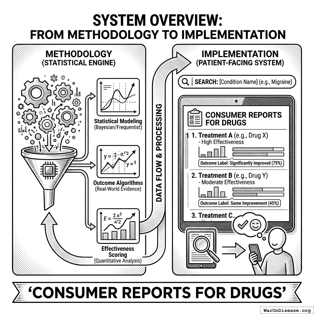
What Patients See
When a patient searches for their condition, they see:
- Treatment Rankings: Every option (FDA-approved drugs, supplements, lifestyle interventions, experimental treatments) ranked by effect size from real patient data
- Outcome Labels: “Nutrition facts for drugs” showing percent improvement, side effect rates, and sample sizes - not marketing claims
- Trial Access: One-click enrollment in available trials, from home, via any device
- Personalized Predictions: Based on their health data, which treatments work best for people like them
What Companies See
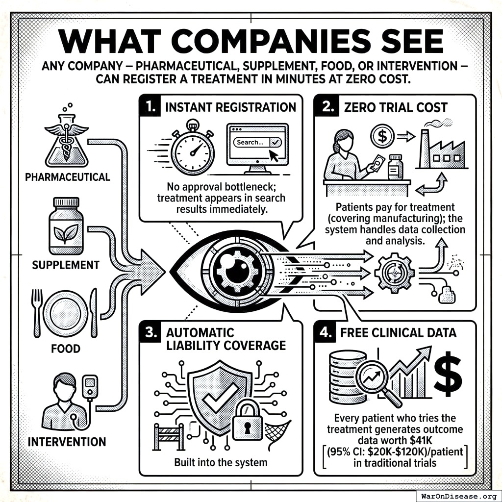
Any company - pharmaceutical, supplement, food, or intervention - can register a treatment in minutes at zero cost:
- Instant Registration: No approval bottleneck; treatment appears in search results immediately
- Zero Trial Cost: Patients pay for treatment (covering manufacturing); the system handles data collection and analysis
- Automatic Liability Coverage: Built into the system
- Free Clinical Data: Every patient who tries the treatment generates outcome data worth $41,000 (95% CI: $20,000-$120,000)/patient in traditional trials
Where This Methodology Fits
The Predictor Impact Score (PIS) described in this paper is the engine that powers treatment rankings. It transforms raw patient data into the ranked, quantified outcome labels that patients and clinicians use to make decisions. The two-stage pipeline ensures that:
- Stage 1 (this methodology) generates treatment rankings from millions of real-world observations at ~$0.1 (95% CI: $0.03-$1)/patient
- Stage 2 (pragmatic trials) confirms causation for high-priority signals at ~$929 (95% CI: $97-$3,000)/patient
The result is a self-improving system where every patient’s experience helps the next patient make better decisions, transforming the current bottleneck of 1.9 million patients/year (95% CI: 1.5 million patients/year-2.3 million patients/year) annual trial participants into a system where anyone can contribute to medical knowledge.
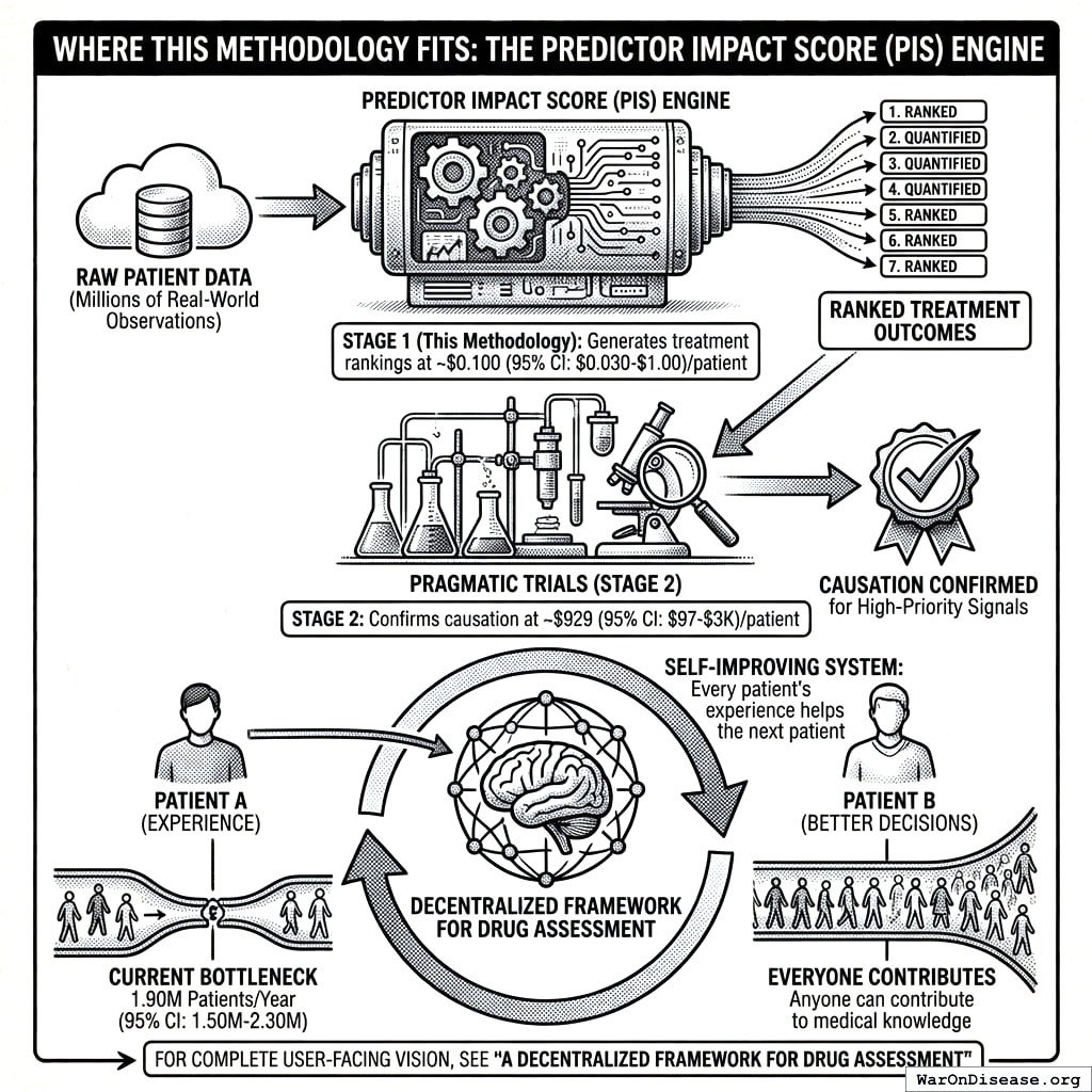
For the complete user-facing vision, see A Decentralized Framework for Drug Assessment.
Introduction
The Human Cost of the Current System
Every year, 55 million people die from diseases for which treatments exist or could exist. The tragedy is not that we lack medical knowledge. It’s that our system for generating and validating that knowledge operates at a fraction of its potential capacity.
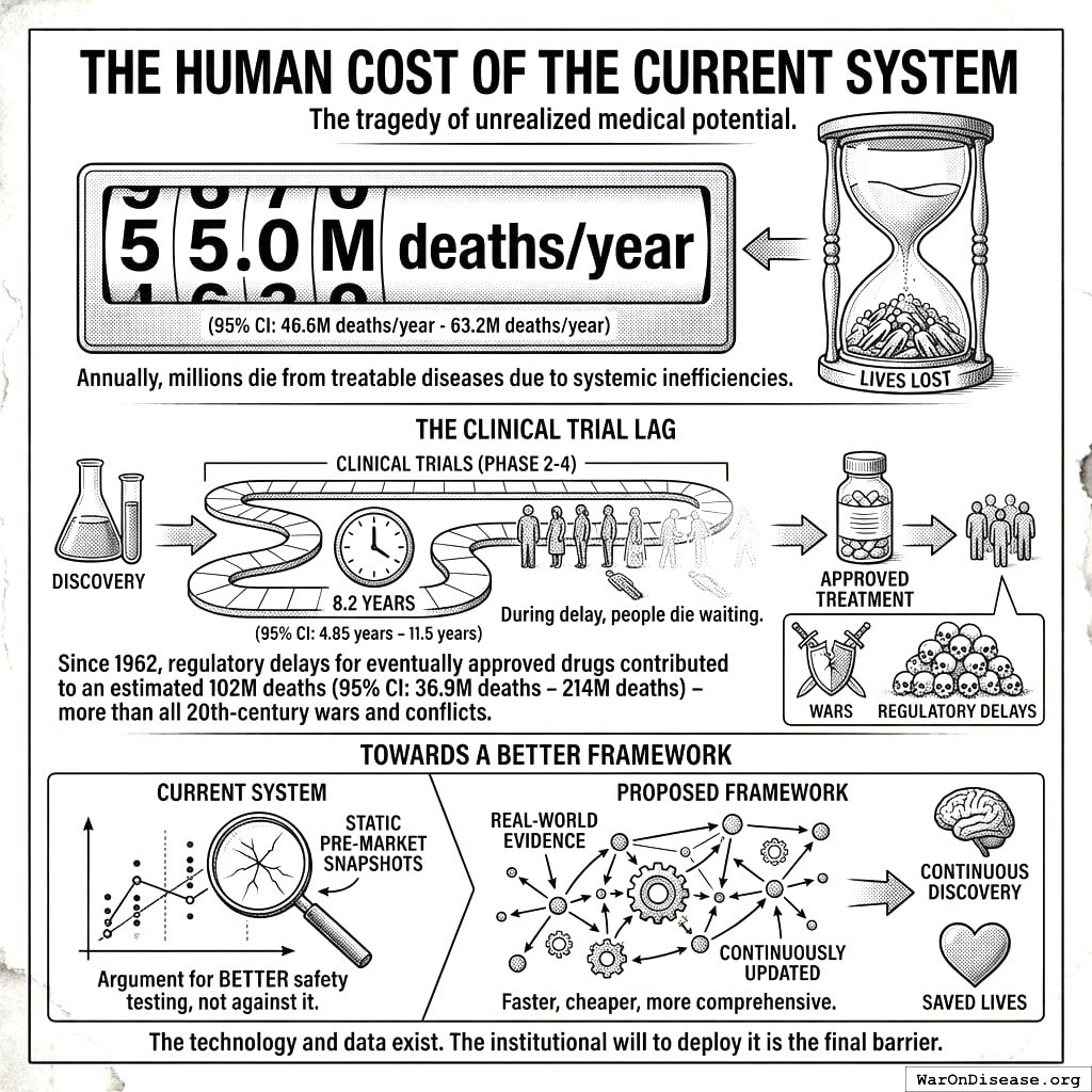
Consider: a treatment that could save lives today takes an average of 8.2 years (95% CI: 4.85 years-11.5 years) to complete Phase 2-4 clinical trials after initial discovery. During this delay, people die waiting. Since 1962, regulatory testing delays for drugs that were eventually approved have contributed to an estimated 102 million preventable deaths, more than all wars and conflicts of the 20th century combined.
This is not an argument against safety testing. It is an argument for better safety testing: faster, cheaper, more comprehensive, and continuously updated with real-world evidence rather than static pre-market snapshots.
The framework presented here could eliminate this efficacy lag for existing treatments while simultaneously enabling continuous discovery of new therapeutic relationships. The technology exists. The data exists. What remains is the institutional will to deploy it.
The Pharmacovigilance Gap
Modern pharmacovigilance (the science of detecting, assessing, and preventing adverse effects of pharmaceutical products) faces fundamental limitations:
Spontaneous Reporting Systems (e.g., FDA FAERS, EU EudraVigilance):
- Estimated 1-10% of adverse events are reported167
- No denominator data (cannot calculate incidence rates)
- Cannot quantify effect sizes or establish causality
- Significant reporting lag (months to years)
- Subject to stimulated reporting and notoriety bias
Pre-Market Clinical Trials:
- Limited sample sizes (typically hundreds to low thousands)
- Short duration (weeks to months)
- Homogeneous populations (exclusion criteria eliminate comorbidities)
- Controlled conditions unlike real-world use
- Cannot detect rare or delayed adverse events
- Cost: Average Phase III trial costs $20 million and takes 3+ years104
Post-Market Studies:
- Expensive and time-consuming
- Often industry-sponsored with potential conflicts
- Limited to specific questions rather than comprehensive monitoring
The Real-World Data Opportunity

The past decade has seen explosive growth in patient-generated health data:
- Wearable devices: 500+ million users globally tracking sleep, activity, heart rate168
- Health apps: Symptom trackers, mood journals, medication reminders
- Connected health platforms: Comprehensive longitudinal health records
- Patient-reported outcomes: Systematic symptom and quality-of-life tracking
This data is characterized by:
- Longitudinal structure: Repeated measurements over months to years
- Natural variation: Patients modify treatments without experimental control
- Real-world conditions: Actual usage patterns, not controlled settings
- Scale: Millions of potential participants
Our Contribution
We present a framework that transforms real-world health data into actionable pharmacovigilance intelligence:
- Quantitative Outcome Labels: For each treatment, generate effect sizes (percent change from baseline) for all measured outcomes
- Treatment Rankings: Rank treatments by efficacy and safety within therapeutic categories
- Automated Signal Detection: Identify safety concerns (negative correlations) and efficacy signals (positive correlations)
- Bradford Hill Integration: Composite scoring that operationalizes causal inference criteria169,170
- Scalable Implementation: Analyze millions of treatment-outcome pairs automatically
This is not a replacement for RCTs but a complement, providing continuous, population-scale monitoring that can:
- Generate hypotheses for experimental validation
- Detect signals missed by spontaneous reporting
- Quantify effects that RCTs can only describe qualitatively
- Enable personalized benefit-risk assessment
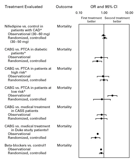
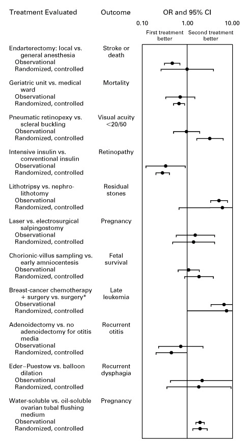
Multiple meta-analyses demonstrate that well-designed observational studies produce effect sizes concordant with randomized controlled trials, supporting the validity of real-world evidence for hypothesis generation:
Data Collection and Integration
Data Sources
Our data integration protocol specifies how data flows from multiple sources, each contributing different variable types:
| Source Category | Examples | Data Types |
|---|---|---|
| Wearables | Fitbit, Apple Watch, Oura Ring, Garmin | Sleep, steps, heart rate, HRV |
| Health Apps | Symptom trackers, mood journals | Symptoms, mood, energy, pain |
| Medication Trackers | Medisafe, MyTherapy | Drug intake, dosage, timing |
| Diet Trackers | MyFitnessPal, Cronometer | Foods, nutrients, calories |
| Lab Integrations | Quest, LabCorp APIs | Biomarkers, blood tests |
| EHR Connections | FHIR-enabled systems | Diagnoses, prescriptions, vitals |
| Manual Entry | Custom tracking | Any user-defined variable |
| Environmental | Weather APIs, air quality | Temperature, humidity, pollution |
Variable Ontology
Variables are organized into semantic categories that inform default processing parameters:
| Category | Examples | Onset Delay | Duration | Filling |
|---|---|---|---|---|
| Treatments | Drugs, supplements | 30 min | 24 hours | Zero |
| Foods | Diet, beverages | 30 min | 10 days | Zero |
| Symptoms | Pain, fatigue, nausea | 0 | 24 hours | None |
| Emotions | Mood, anxiety, depression | 0 | 24 hours | None |
| Vital Signs | Blood pressure, glucose | 0 | 24 hours | None |
| Sleep | Duration, quality, latency | 0 | 24 hours | None |
| Physical Activity | Steps, exercise, calories burned | 0 | 24 hours | None |
| Environment | Weather, air quality, allergens | 0 | 24 hours | None |
| Physique | Weight, body fat, measurements | 0 | 7 days | None |
Measurement Structure

Each measurement includes:
Measurement {
    variable_id: int           // Reference to variable definition
    user_id: int               // Anonymized participant identifier
    value: float               // Numeric measurement value
    unit_id: int               // Standardized unit reference
    start_time: timestamp      // When measurement was taken
    source_id: int             // Data source for provenance
    note: string (optional)    // User annotation
}
Unit Standardization
The measurement standardization protocol converts all measurements to standardized units for cross-source compatibility:
- Weights → kilograms
- Distances → meters
- Temperatures → Celsius
- Dosages → milligrams
- Durations → seconds
- Percentages → 0-100 scale
- Ratings → 1-5 scale (normalized)
Mathematical Framework
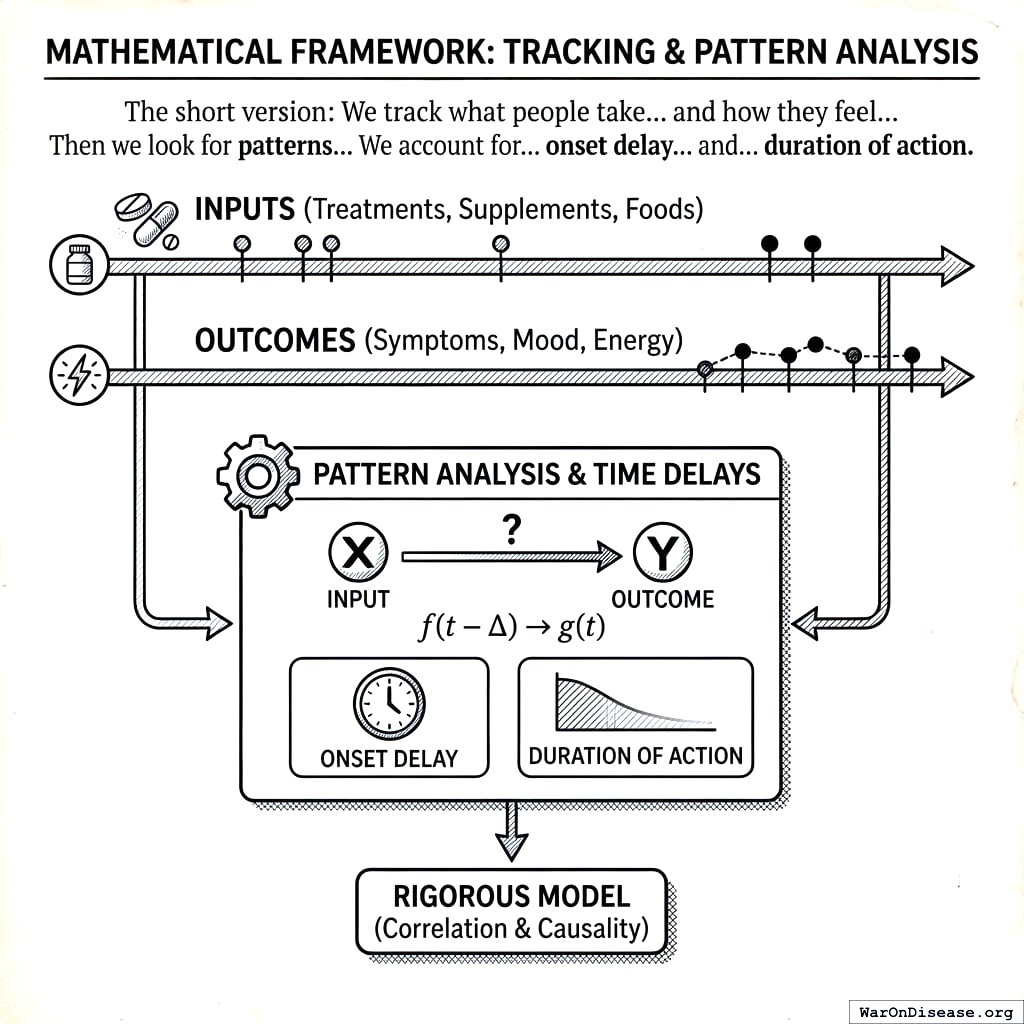
The short version: We track what people take (treatments, supplements, foods) and how they feel (symptoms, mood, energy) over time. Then we look for patterns: “When people take more of X, does Y get better or worse?” We account for the fact that treatments take time to work (onset delay) and their effects fade (duration of action). The math below makes this rigorous.
Data Structure
For each participant \(i \in \{1, ..., N\}\), we observe time series of predictor variable \(P\) (e.g., treatment) and outcome variable \(O\) (e.g., symptom):
\[P_i = \{(t_{i,1}^P, p_{i,1}), (t_{i,2}^P, p_{i,2}), ..., (t_{i,n_i}^P, p_{i,n_i})\}\]
\[O_i = \{(t_{i,1}^O, o_{i,1}), (t_{i,2}^O, o_{i,2}), ..., (t_{i,m_i}^O, o_{i,m_i})\}\]
where \(t\) denotes timestamp, \(p\) denotes predictor measurements, and \(o\) denotes outcome measurements. Critically, timestamps need not be aligned. The temporal alignment protocol handles asynchronous, irregular sampling.
Temporal Alignment
Onset Delay and Duration of Action
Treatments do not produce immediate effects. We define:
- Onset delay \(\delta\): Time lag before treatment produces observable effect
- Duration of action \(\tau\): Time window over which effect persists
Constraints: \[0 \leq \delta \leq 8{,}640{,}000 \text{ seconds (100 days)}\] \[600 \leq \tau \leq 7{,}776{,}000 \text{ seconds (90 days)}\]
Outcome Window Calculation
For a predictor measurement at time \(t\), we associate it with outcome measurements in the window:
\[W(t) = \{t_j : t + \delta \leq t_j \leq t + \delta + \tau\}\]
The aligned outcome value is computed as the mean:
\[\bar{o}(t) = \frac{1}{|W(t)|} \sum_{t_j \in W(t)} o_j\]
Pair Generation Strategies
We employ two complementary strategies depending on variable characteristics:
Outcome-Based Pairing (Predictor has Filling Value)
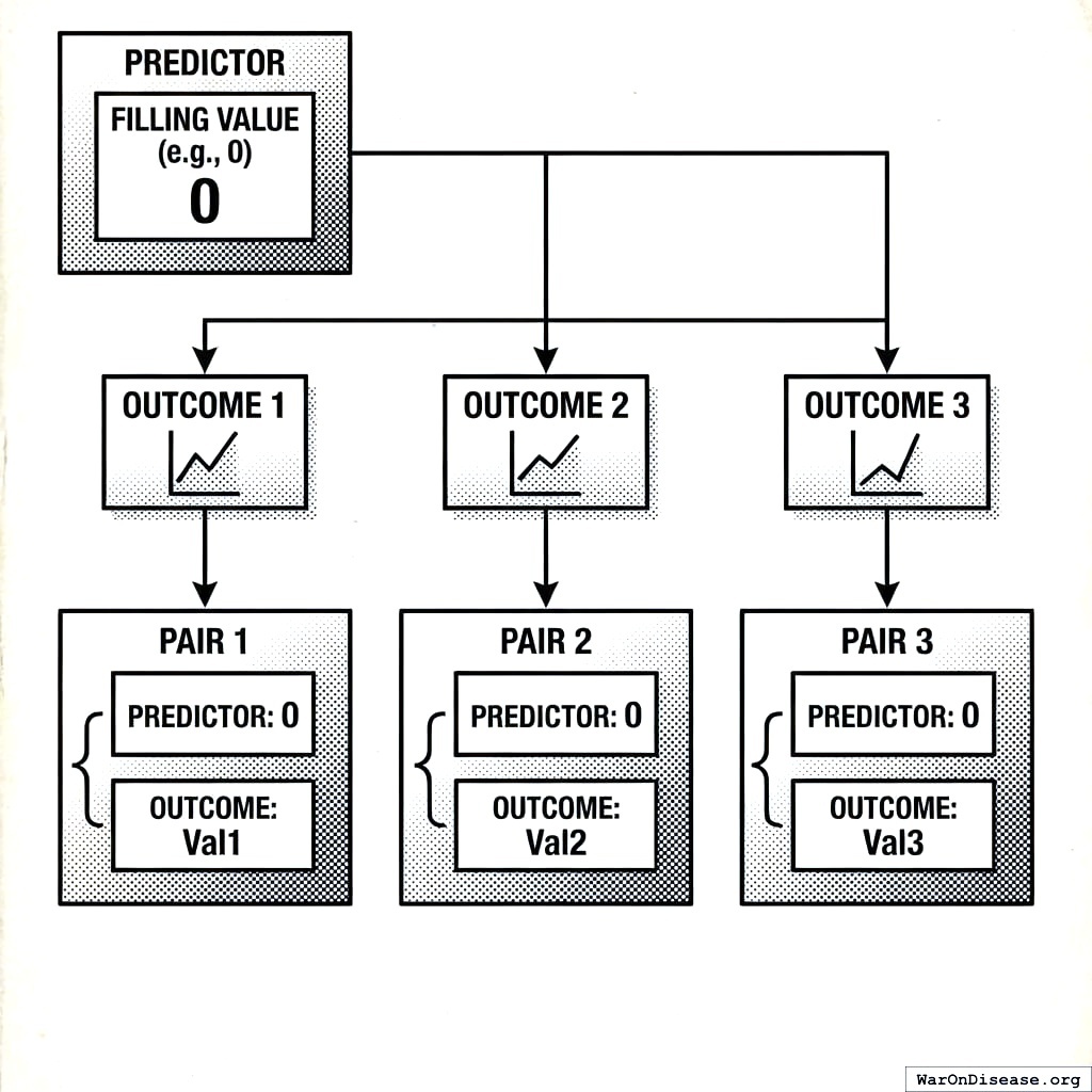
When the predictor has a filling value (e.g., zero for “not taken”), we create one pair per outcome measurement:
For each outcome measurement (t_o, o):
    window_end = t_o - delta
    window_start = window_end - tau + 1

    predictor_values = measurements in [window_start, window_end]

    if predictor_values is empty:
        predictor_value = filling_value  // e.g., 0
    else:
        predictor_value = mean(predictor_values)

    create_pair(predictor_value, o)
Predictor-Based Pairing (No Filling Value)
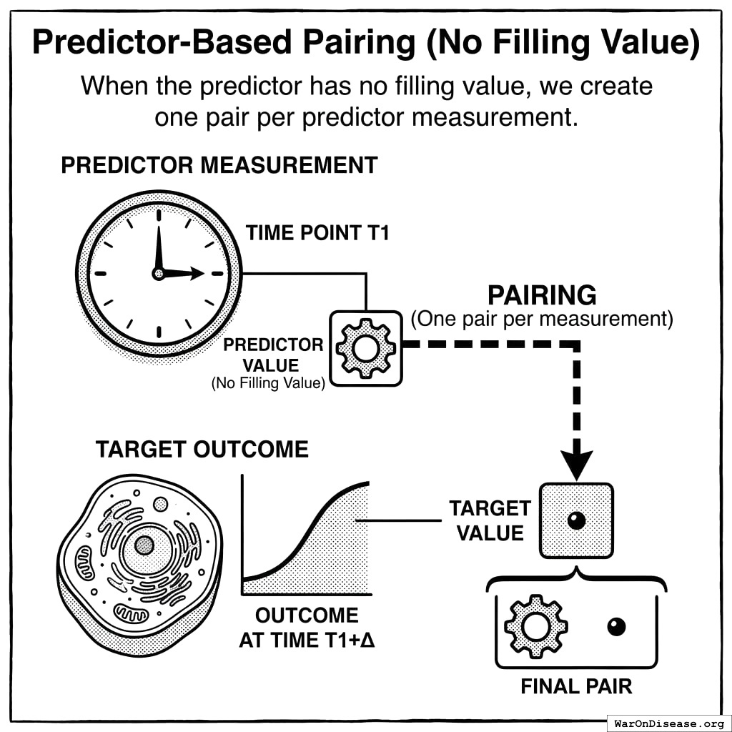
When the predictor has no filling value, we create one pair per predictor measurement:
For each predictor measurement (t_p, p):
    window_start = t_p + delta
    window_end = window_start + tau - 1

    outcome_values = measurements in [window_start, window_end]

    if outcome_values is empty:
        skip this pair
    else:
        outcome_value = mean(outcome_values)
        create_pair(p, outcome_value)
Filling Value Logic
Filling Types
| Type | Description | Use Case |
|---|---|---|
| Zero | Missing = 0 | Treatments (assume not taken) |
| Value | Missing = specific constant | Known default states |
| None | No imputation | Continuous outcomes |
| Interpolation | Linear interpolation | Slowly-changing variables |
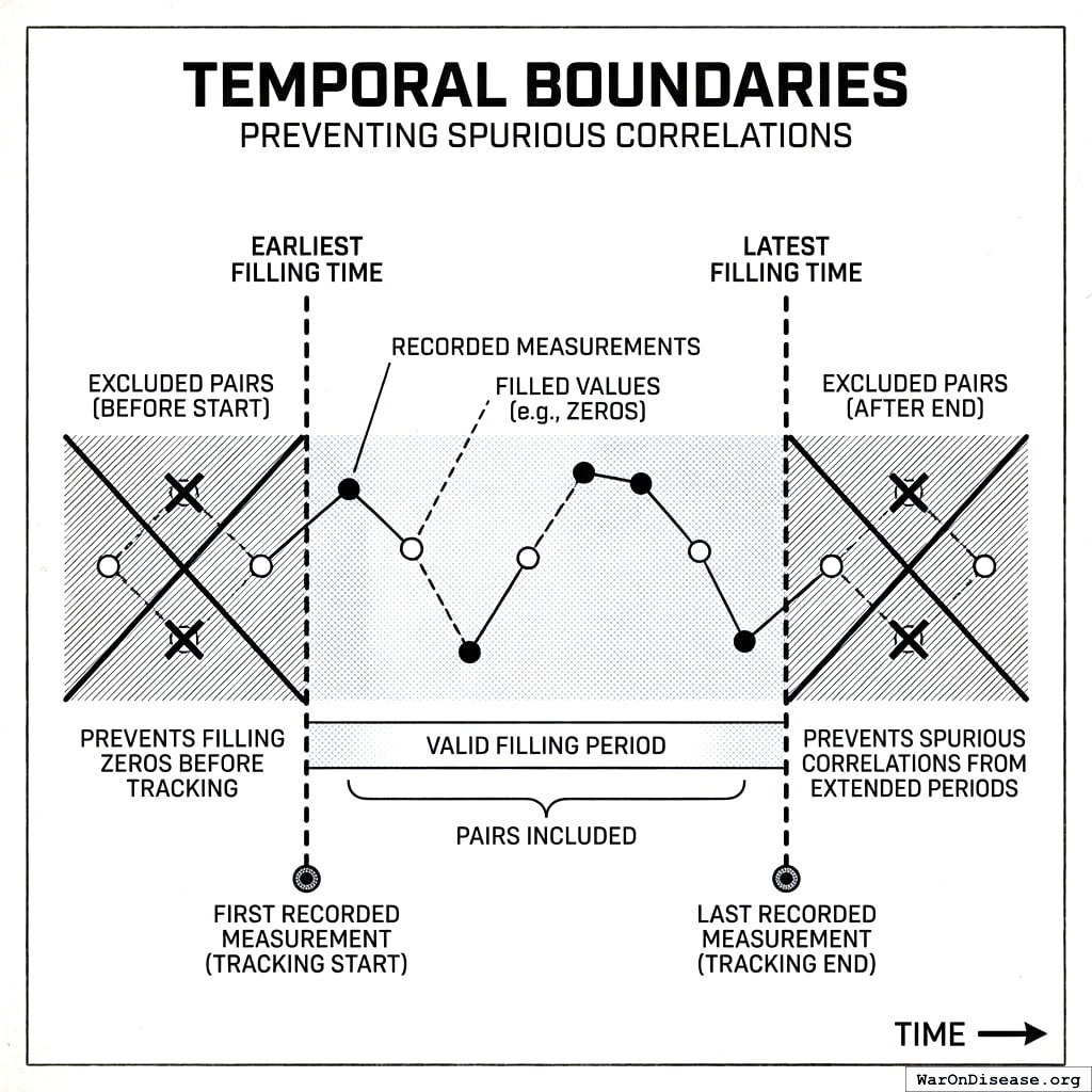
Temporal Boundaries
To prevent spurious correlations from extended filling periods:
- Earliest filling time: First recorded measurement (tracking start)
- Latest filling time: Last recorded measurement (tracking end)
Pairs outside these boundaries are excluded. This prevents filling zeros for a treatment before the participant started tracking it.
Conservative Bias
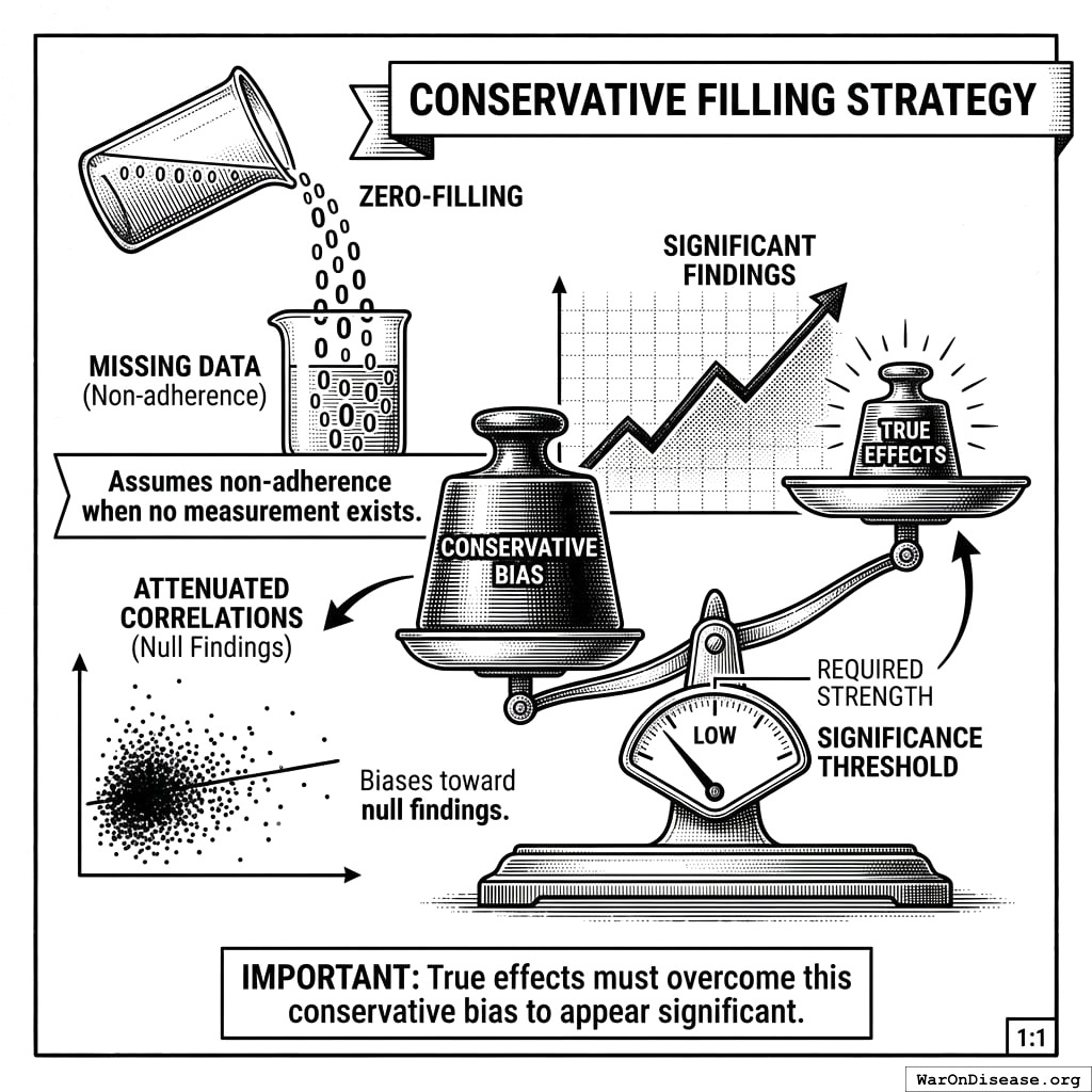
Our filling strategy is deliberately conservative:
- Zero-filling for treatments assumes non-adherence when no measurement exists
- This biases toward null findings (attenuated correlations) rather than false positives
- True effects must overcome this conservative bias to appear significant
Baseline Definition and Outcome Estimation
Within-Subject Comparison
For each participant \(i\), we compute the mean predictor value:
\[\bar{p}_i = \frac{1}{n_i} \sum_{j=1}^{n_i} p_{i,j}\]
We partition measurements into baseline and follow-up periods:
\[\text{Baseline}_i = \{(p, o) : p < \bar{p}_i\}\] \[\text{Follow-up}_i = \{(p, o) : p \geq \bar{p}_i\}\]
This creates a natural within-subject comparison:
- Baseline: Periods of below-average predictor exposure
- Follow-up: Periods of above-average predictor exposure
Outcome Means
\[\mu_{\text{baseline},i} = \mathbb{E}[o \mid p < \bar{p}_i]\] \[\mu_{\text{follow-up},i} = \mathbb{E}[o \mid p \geq \bar{p}_i]\]
Percent Change from Baseline
The primary effect size metric:
\[\Delta_i = \frac{\mu_{\text{follow-up},i} - \mu_{\text{baseline},i}}{\mu_{\text{baseline},i}} \times 100\]
Advantages:
- Interpretability: “15% reduction in pain” is intuitive
- Scale invariance: Enables comparison across different outcome measures
- Clinical relevance: Standard metric in medical literature
- Regulatory familiarity: FDA uses percent change in efficacy assessments
Correlation Coefficients
We compute both parametric and non-parametric measures:
Pearson Correlation (Linear Relationships)
\[r_{\text{Pearson}} = \frac{\sum_{j=1}^{n}(p_j - \bar{p})(o_j - \bar{o})}{\sqrt{\sum_{j=1}^{n}(p_j - \bar{p})^2} \cdot \sqrt{\sum_{j=1}^{n}(o_j - \bar{o})^2}}\]
Spearman Rank Correlation (Monotonic Relationships)
\[r_{\text{Spearman}} = 1 - \frac{6 \sum_{j=1}^{n} d_j^2}{n(n^2 - 1)}\]
where \(d_j = \text{rank}(p_j) - \text{rank}(o_j)\).
Forward and Reverse Correlations
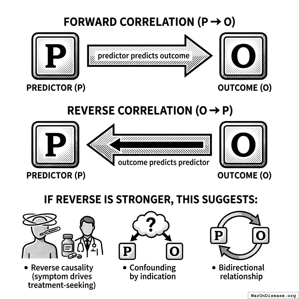
We compute both:
- Forward: \(P \to O\) (predictor predicts outcome)
- Reverse: \(O \to P\) (outcome predicts predictor)
If reverse correlation is stronger, this suggests:
- Reverse causality (symptom drives treatment-seeking)
- Confounding by indication
- Bidirectional relationship
Z-Score Normalization
To assess effect magnitude relative to natural variability:
\[z = \frac{|\Delta|}{\text{RSD}_{\text{baseline}}}\]
where relative standard deviation:
\[\text{RSD}_{\text{baseline}} = \frac{\sigma_{\text{baseline}}}{\mu_{\text{baseline}}} \times 100\]
Interpretation: \(z > 2\) indicates \(p < 0.05\) under normality, meaning the observed effect exceeds typical baseline fluctuation.
Statistical Significance
Two-tailed t-test for correlation significance:
\[t = \frac{r\sqrt{n-2}}{\sqrt{1-r^2}}\]
with \(n-2\) degrees of freedom. Reject null hypothesis (\(H_0: \rho = 0\)) at \(\alpha = 0.05\) when:
\[|t| > t_{\text{critical}}(n-2, \alpha/2)\]
Hyperparameter Optimization
The onset delay \(\delta^*\) and duration of action \(\tau^*\) are selected to maximize correlation coefficient strength:
\[(\delta^*, \tau^*) = \underset{\delta, \tau}{\text{argmax}} \; |r(\delta, \tau)|\]
Search Strategy: 1. Initialize with category defaults (e.g., 30 min onset, 24 hr duration for drugs) 2. Grid search over physiologically plausible ranges 3. Select parameters yielding strongest correlation coefficient
Overfitting Mitigation:
- Restrict search to category-appropriate ranges
- Require minimum sample size before optimization
- Report both optimized and default-parameter results
Population Aggregation
Individual to Population
For population-level estimates, aggregate across \(N\) participants:
\[\bar{r} = \frac{1}{N} \sum_{i=1}^{N} r_i\]
\[\bar{\Delta} = \frac{1}{N} \sum_{i=1}^{N} \Delta_i\]
Standard Error and Confidence Intervals
\[\text{SE}_{\bar{r}} = \frac{\sigma_r}{\sqrt{N}}\]
\[\text{CI}_{95\%} = \bar{r} \pm 1.96 \cdot \text{SE}_{\bar{r}}\]
Heterogeneity Assessment
Between-participant variance:
\[\sigma^2_{\text{between}} = \text{Var}(r_i)\]
High heterogeneity suggests:
- Subgroup effects (responders vs. non-responders)
- Interaction with unmeasured factors
- Need for personalized analysis
Data Quality Requirements
Minimum Thresholds
| Requirement | Threshold | Rationale |
|---|---|---|
| Predictor value changes | \(\geq 5\) | Ensures sufficient variance |
| Outcome value changes | \(\geq 5\) | Ensures sufficient variance |
| Overlapping pairs | \(\geq 30\) | Central limit theorem |
| Baseline fraction | \(\geq 10\%\) | Adequate baseline |
| Follow-up fraction | \(\geq 10\%\) | Adequate predictor exposure |
| Processed daily measurements | \(\geq 4\) | Minimum data density |
Variance Validation
Before computing variable relationships, validate sufficient variance:
\[\text{changes}(X) = \sum_{j=1}^{n-1} \mathbb{1}[x_j \neq x_{j+1}]\]
If \(\text{changes}(P) < 5\) or \(\text{changes}(O) < 5\), abort with InsufficientVarianceException.
Outcome Value Spread
\[\text{spread}_O = \max(O) - \min(O)\]
Variable relationships with zero spread are undefined and excluded.
Predictor Impact Score
The short version: Not all correlations are created equal. If we observe that “people who take Drug X report less pain,” how confident should we be? The Predictor Impact Score (PIS) answers this by combining: (1) how strong is the relationship, (2) how many people show it, (3) does the drug come before the improvement (not after), and (4) is there a dose-response pattern. High PIS = worth investigating in a clinical trial. Low PIS = probably noise.
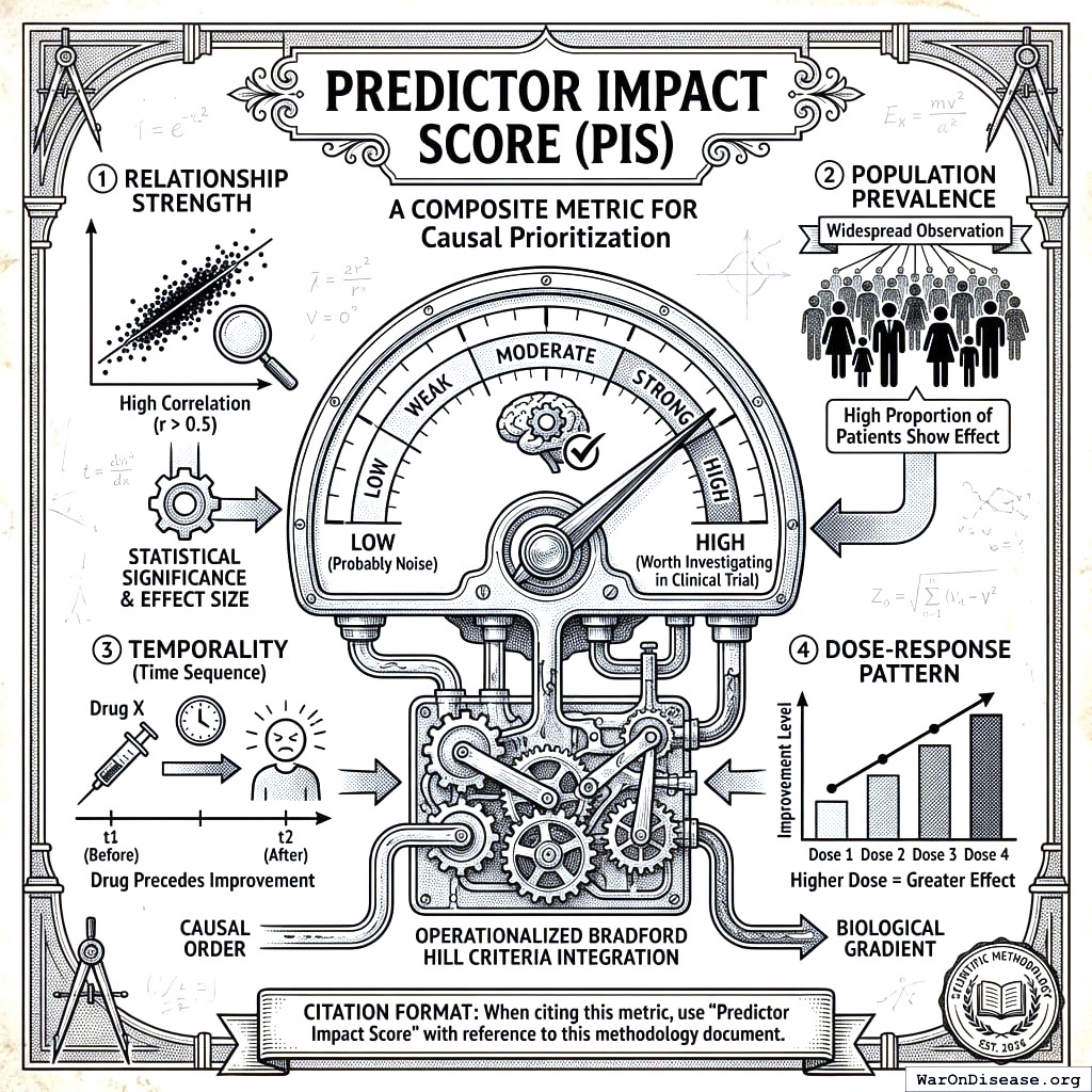
The Predictor Impact Score (PIS) is a composite metric that quantifies treatment-outcome relationship strength from patient health data, operationalizing Bradford Hill causality criteria to prioritize drug effects for clinical trial validation. It integrates correlation strength, statistical significance, effect magnitude, and multiple Bradford Hill criteria into a single interpretable score. Higher scores indicate predictors with greater, more reliable impact on the outcome.
Citation format: When citing this metric in academic work, use “Predictor Impact Score” with reference to this methodology document.
What Makes the Predictor Impact Score Novel
Unlike simple correlation coefficients, PIS addresses fundamental limitations of observational analysis:
Sample size agnosticism: Raw correlations don’t account for whether N=10 or N=10,000. PIS incorporates saturation functions that weight evidence accumulation.
Temporal ambiguity: Correlations can’t distinguish A→B from B→A. PIS includes a temporality factor comparing forward vs. reverse correlations.
Effect magnitude blindness: Statistical significance ≠ practical significance. PIS incorporates z-scores to assess effect magnitude relative to baseline variability.
Isolated metrics: Traditional analysis reports correlation, p-value, and effect size separately. PIS integrates them into a single prioritization metric aligned with Bradford Hill criteria.
The Predictor Impact Score is not a causal proof. It’s a principled heuristic for ranking which predictor-outcome relationships warrant further investigation, including experimental validation.
User-Level Predictor Impact Score
For individual participant (N-of-1) analyses, we compute:
\[\text{PIS}_{\text{user}} = |r| \cdot S \cdot \phi_z \cdot \phi_{\text{temporal}} \cdot f_{\text{interest}} + \text{PIS}_{\text{agg}}\]
Where:
- \(|r|\) = absolute value of the correlation coefficient (strength)
- \(S\) = statistical significance (1 - p-value)
- \(\phi_z\) = normalized z-score factor (effect magnitude)
- \(\phi_{\text{temporal}}\) = temporality factor (forward vs. reverse causation)
- \(f_{\text{interest}}\) = interest factor (penalizes spurious variable pairs)
- \(\text{PIS}_{\text{agg}}\) = population-level aggregate score (provides context from broader population)
Aggregate (Population-Level) Predictor Impact Score
For population-level analyses aggregated across multiple participants:
\[\text{PIS}_{\text{agg}} = |r_{\text{forward}}| \cdot w \cdot \phi_{\text{users}} \cdot \phi_{\text{pairs}} \cdot \phi_{\text{change}} \cdot \phi_{\text{gradient}}\]
Where:
- \(|r_{\text{forward}}|\) = absolute forward Pearson correlation coefficient (strength)
- \(w\) = weighted average of community votes on plausibility
- \(\phi_{\text{users}} = 1 - e^{-N / N_{\text{sig}}}\) (user saturation, \(N_{\text{sig}} = 10\))
- \(\phi_{\text{pairs}} = 1 - e^{-n / n_{\text{sig}}}\) (pair saturation, \(n_{\text{sig}}\) = significant pairs threshold)
- \(\phi_{\text{change}} = 1 - e^{-\Delta_{\text{spread}} / \Delta_{\text{sig}}}\) (change spread saturation)
- \(\phi_{\text{gradient}}\) = biological gradient coefficient (dose-response)
The saturation functions asymptotically approach 1 as sample sizes increase, reflecting that consistent findings across more participants strengthen causal inference.
Z-Score and Effect Magnitude Factor
The z-score quantifies the magnitude of the outcome change relative to baseline variability:
\[z = \frac{|\Delta\%_{\text{baseline}}|}{\text{RSD}_{\text{baseline}}}\]
Where:
- \(\Delta\%_{\text{baseline}}\) = percent change from baseline (see below)
- \(\text{RSD}_{\text{baseline}}\) = relative standard deviation of outcome during baseline period
A z-score > 2 indicates statistical significance (p < 0.05), meaning the observed change is unlikely due to random variation.
The normalized z-score factor incorporates effect magnitude into the PIS score:
\[\phi_z = \frac{|z|}{|z| + z_{\text{ref}}}\]
Where \(z_{\text{ref}} = 2\) (the conventional significance threshold). This saturating function:
- Approaches 0 for negligible effects (z → 0)
- Equals 0.5 at the significance threshold (z = 2)
- Approaches 1 for very large effects (z → ∞)
Temporality Factor
The temporality factor quantifies evidence that the predictor precedes and causes the outcome (rather than reverse causation):
\[\phi_{\text{temporal}} = \frac{|r_{\text{forward}}|}{|r_{\text{forward}}| + |r_{\text{reverse}}|}\]
Where:
- \(r_{\text{forward}}\) = correlation when predictor precedes outcome (P → O)
- \(r_{\text{reverse}}\) = correlation when outcome precedes predictor (O → P)
This factor:
- Equals 0.5 when forward and reverse correlations are equal (ambiguous causality)
- Approaches 1 when forward correlation dominates (supports predictor → outcome)
- Approaches 0 when reverse correlation dominates (suggests reverse causation or confounding by indication)
Percent Change from Baseline
The primary effect size metric expressing treatment impact:
\[\Delta\%_{\text{baseline}} = \frac{\bar{O}_{\text{follow-up}} - \bar{O}_{\text{baseline}}}{\bar{O}_{\text{baseline}}} \times 100\]
Where:
- \(\bar{O}_{\text{follow-up}}\) = mean outcome value during follow-up period (after predictor exposure)
- \(\bar{O}_{\text{baseline}}\) = mean outcome value during baseline period (before predictor exposure)
For outcomes measured in percentages or with zero baseline, we use absolute change instead: \[\Delta_{\text{abs}} = \bar{O}_{\text{follow-up}} - \bar{O}_{\text{baseline}}\]
Statistical Significance
The statistical significance component captures confidence in the relationship:
\[S = 1 - p\]
Where \(p\) is the p-value from the correlation significance test. Higher values indicate greater confidence that the observed relationship is not due to chance.
Interest Factor
The interest factor \(f_{\text{interest}}\) penalizes likely spurious or uninteresting variable pairs:
\[f_{\text{interest}} = f_P \cdot f_O \cdot f_{\text{pair}}\]
Where:
- \(f_P\) = predictor interest factor (reduced for test variables, apps, addresses)
- \(f_O\) = outcome interest factor (reduced for non-outcome categories)
- \(f_{\text{pair}}\) = pair appropriateness (reduced for illogical category combinations)
Additional Data Quality Components
Skewness Coefficient (penalizes non-normal distributions): \[\phi_{\text{skew}} = \frac{1}{1 + \gamma_{P}^2} \cdot \frac{1}{1 + \gamma_{O}^2}\]
Kurtosis Coefficient (penalizes heavy tails): \[\phi_{\text{kurt}} = \frac{1}{1 + \kappa_{P}^2} \cdot \frac{1}{1 + \kappa_{O}^2}\]
Biological Gradient (dose-response relationship): \[\phi_{\text{gradient}} = \left(\frac{\bar{p}_{\text{high}} - \bar{p}}{\sigma_P} - \frac{\bar{p}_{\text{low}} - \bar{p}}{\sigma_P}\right)^2\]
Measures the standardized difference between predictor values that predict high vs. low outcomes.
Bradford Hill Criteria Mapping
The PIS operationalizes six of the nine Bradford Hill criteria for causality171:
| Component | Formula | Bradford Hill Criterion | In PIS Formula |
|---|---|---|---|
| \(\|r\|\) | Correlation magnitude | Strength | Yes (direct) |
| \(\phi_z\) | Normalized z-score | Strength (effect magnitude) | Yes (user-level) |
| \(\Delta\%\) | Percent change from baseline | Strength (clinical significance) | Yes (via \(\phi_z\)) |
| \(\phi_{\text{users}}, \phi_{\text{pairs}}\) | Sample saturation | Consistency | Yes (aggregate) |
| \(\phi_{\text{gradient}}\) | Dose-response coefficient | Biological Gradient | Yes (aggregate) |
| \(w\) | Weighted community votes | Plausibility | Yes (aggregate) |
| \(f_{\text{interest}}\) | Category appropriateness | Specificity | Yes (user-level) |
| \(\phi_{\text{temporal}}\) | Forward/reverse ratio | Temporality | Yes (user-level) |
| \(\delta > 0\) | Onset delay requirement | Temporality | Enforced in design |
Interpreting Predictor Impact Scores
Provisional Thresholds - Not Yet Validated
The PIS thresholds below are theoretically motivated heuristics, not empirically validated cutoffs. Until retrospective validation against RCT outcomes is performed (see Validation Framework), these thresholds should be treated as provisional guidelines for prioritization, not evidence standards.
PIS scores range from 0 to approximately 1 (though values slightly above 1 are possible with very strong evidence). Guidelines for interpretation:
| PIS Range | Interpretation | Recommended Action |
|---|---|---|
| ≥ 0.5 | Strong evidence | High priority for RCT validation |
| 0.3 - 0.5 | Moderate evidence | Consider for experimental investigation |
| 0.1 - 0.3 | Weak evidence | Monitor for additional data |
| < 0.1 | Insufficient evidence | Low priority; may be noise |
Important caveats:
- These thresholds are preliminary and should be validated against RCT outcomes
- PIS is relative, not absolute. Use it for prioritization, not proof.
- High PIS does not guarantee causation; low PIS does not rule it out
- Context matters: a PIS of 0.2 for a novel relationship may be more interesting than 0.5 for a known one
Optimal Daily Value for Precision Dosing
A key output of our analysis is the optimal daily value, the predictor value that historically precedes the best outcomes. This enables personalized, precision dosing recommendations.
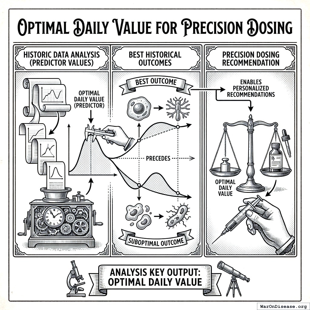
Value Predicting High Outcome
The Value Predicting High Outcome (\(V_{\text{high}}\)) is the average predictor value observed when the outcome exceeds its mean:
\[V_{\text{high}} = \frac{1}{|H|} \sum_{(p, o) \in H} p\]
Where:
- \(H = \{(p, o) : o > \bar{O}\}\) is the set of predictor-outcome pairs where outcome exceeds its average
- \(\bar{O}\) = mean outcome value across all pairs
- \(p\) = predictor (cause) value for each pair
Calculation Process: 1. Compute the average outcome value (\(\bar{O}\)) across all predictor-outcome pairs 2. Filter pairs to include only those where outcome > \(\bar{O}\) (the “high effect” pairs) 3. Calculate the mean predictor value across these high-effect pairs
Value Predicting Low Outcome
The Value Predicting Low Outcome (\(V_{\text{low}}\)) is the average predictor value observed when the outcome is below its mean:
\[V_{\text{low}} = \frac{1}{|L|} \sum_{(p, o) \in L} p\]
Where:
- \(L = \{(p, o) : o < \bar{O}\}\) is the set of predictor-outcome pairs where outcome is below its average
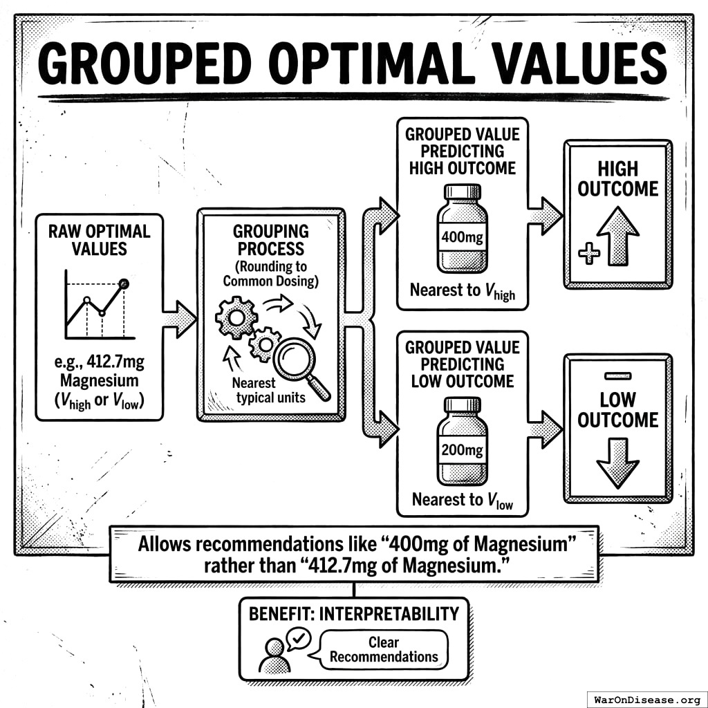
Grouped Optimal Values
For interpretability, we also calculate grouped optimal values that map to common dosing intervals:
- Grouped Value Predicting High Outcome: The nearest grouped predictor value (e.g., rounded to typical dosing units) to \(V_{\text{high}}\)
- Grouped Value Predicting Low Outcome: The nearest grouped predictor value to \(V_{\text{low}}\)
This allows recommendations like “400mg of Magnesium” rather than “412.7mg of Magnesium.”
Precision Dosing Recommendations
These optimal values enable personalized recommendations:
For Positive Valence Outcomes (where higher is better, e.g., energy, sleep quality): > “Your [Outcome] was highest after [Grouped Value Predicting High Outcome] of [Predictor] over the previous [Duration of Action].” > > Example: “Your Sleep Quality was highest after 400mg of Magnesium over the previous 24 hours.”
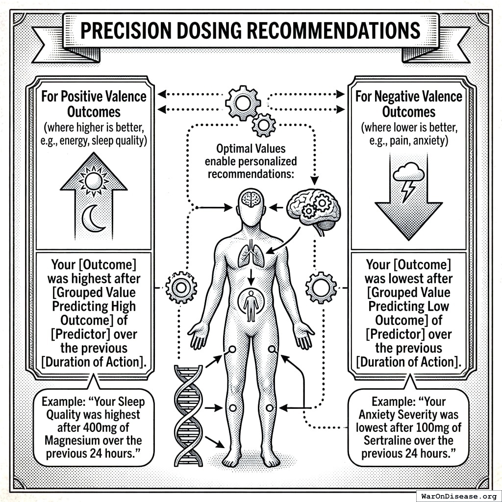
For Negative Valence Outcomes (where lower is better, e.g., pain, anxiety): > “Your [Outcome] was lowest after [Grouped Value Predicting Low Outcome] of [Predictor] over the previous [Duration of Action].” > > Example: “Your Anxiety Severity was lowest after 100mg of Sertraline over the previous 24 hours.”
Mathematical Relationship to Biological Gradient
The optimal values are closely related to the biological gradient coefficient (\(\phi_{\text{gradient}}\)):
\[\phi_{\text{gradient}} = \left(\frac{V_{\text{high}} - \bar{P}}{\sigma_P} - \frac{V_{\text{low}} - \bar{P}}{\sigma_P}\right)^2\]
A larger separation between \(V_{\text{high}}\) and \(V_{\text{low}}\) indicates:
- Stronger dose-response relationship
- More reliable precision dosing recommendations
- Higher biological gradient coefficient
Clinical Applications
| Metric | Definition | Clinical Use |
|---|---|---|
| \(V_{\text{high}}\) | Avg predictor when outcome > mean | Optimal dose for positive outcomes |
| \(V_{\text{low}}\) | Avg predictor when outcome < mean | Dose to avoid for positive outcomes |
| \(V_{\text{high}} - V_{\text{low}}\) | Optimal value spread | Magnitude of dose-response effect |
Example Application: For a participant tracking Magnesium supplementation and Sleep Quality:
- \(V_{\text{high}}\) = 412mg → Grouped = 400mg (sleep quality highest after this dose)
- \(V_{\text{low}}\) = 127mg → Grouped = 125mg (sleep quality lowest after this dose)
- Recommendation: “Take approximately 400mg of Magnesium for optimal sleep quality”
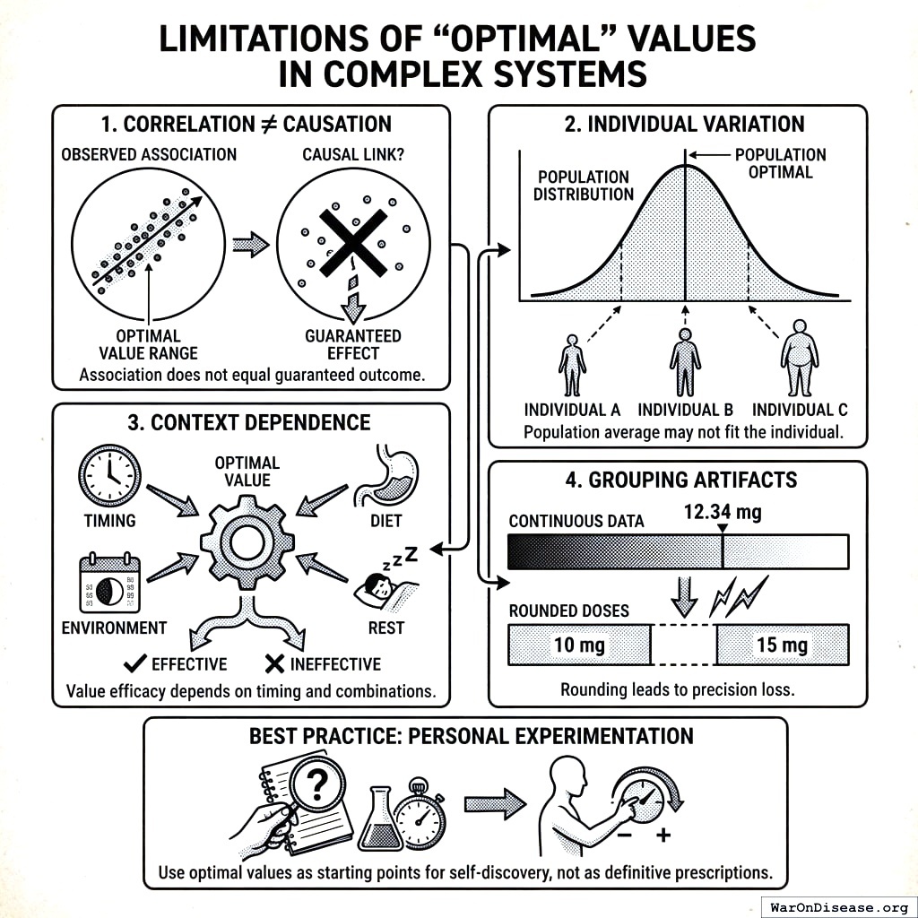
Limitations
- Correlation ≠ Causation: Optimal values reflect associations, not guaranteed causal effects
- Individual Variation: Population optimal values may not be optimal for all individuals
- Context Dependence: Optimal values may vary by timing, combination with other factors
- Grouping Artifacts: Rounding to common doses may lose precision
Best Practice: Use optimal values as starting points for personal experimentation, not as definitive prescriptions.
Confidence Intervals for Optimal Values
Optimal values should be reported with uncertainty bounds to convey reliability:
\[\text{CI}_{V_{\text{high}}} = V_{\text{high}} \pm t_{\alpha/2} \cdot \frac{\sigma_{p|H}}{\sqrt{|H|}}\]
Where:
- \(\sigma_{p|H}\) = standard deviation of predictor values in high-outcome set \(H\)
- \(|H|\) = number of pairs in high-outcome set
- \(t_{\alpha/2}\) = critical t-value for desired confidence level
Interpretation Guidelines:
| CI Width (relative to mean) | Reliability | Recommendation |
|---|---|---|
| < 10% | High | Use as primary recommendation |
| 10-25% | Moderate | Present as range (e.g., “350-450mg”) |
| 25-50% | Low | Insufficient precision for dosing |
| > 50% | Very Low | Do not use for recommendations |
Example: If \(V_{\text{high}} = 400\text{mg}\) with 95% CI [380, 420], report: “Optimal dose: 400mg (95% CI: 380-420mg)”
Individual vs Population Optimal Values
Both individual and population optimal values are computed and stored. Guidelines for use:
| Scenario | Recommended Source | Rationale |
|---|---|---|
| User has ≥50 paired measurements | Individual \(V_{\text{high}}\) | Sufficient personal data |
| User has 20-50 measurements | Weighted blend | \(0.5 \cdot V_{\text{user}} + 0.5 \cdot V_{\text{pop}}\) |
| User has <20 measurements | Population \(V_{\text{high}}\) | Insufficient personal data |
| User’s optimal differs >50% from population | Flag for review | May indicate unique response or data quality issue |
Blending Formula:
\[V_{\text{recommended}} = w \cdot V_{\text{user}} + (1-w) \cdot V_{\text{pop}}\]
Where \(w = \min(1, n_{\text{user}} / n_{\text{threshold}})\) with \(n_{\text{threshold}} = 50\) pairs.
Temporal Stability and Recalculation
Optimal values may drift over time due to:
- Physiological changes (age, weight, health status)
- Tolerance development
- Seasonal factors
- Lifestyle changes
Recalculation Policy:
| Trigger | Action |
|---|---|
| New measurements added | Recalculate after every 10 new pairs |
| Time elapsed | Recalculate monthly regardless of new data |
| Significant life change | User-triggered recalculation |
| Optimal value drift >20% | Alert user to potential change |
Rolling Window Option: For treatments where tolerance is expected, compute optimal values using only the most recent 90 days of data rather than all historical data.
Stability Metric: \[\text{Stability} = 1 - \frac{|V_{\text{high}}^{\text{current}} - V_{\text{high}}^{\text{previous}}|}{V_{\text{high}}^{\text{previous}}}\]
Stability < 0.8 (>20% change) triggers a notification to the user.
Edge Cases: Minimal Dose-Response
When \(V_{\text{high}} \approx V_{\text{low}}\), the predictor shows no clear dose-response relationship:
Detection Criterion: \[\frac{|V_{\text{high}} - V_{\text{low}}|}{\sigma_P} < 0.5\]
(Less than half a standard deviation apart)
Possible Interpretations: 1. Threshold effect: Any dose above zero works equally well 2. No effect: Predictor doesn’t influence outcome 3. Non-linear response: U-shaped or inverted-U curve not captured by simple high/low split 4. Insufficient variance: User takes similar doses, preventing detection
Handling:
- Do not display optimal value recommendations when dose-response is minimal
- Instead report: “No clear dose-response relationship detected for [Predictor] → [Outcome]”
- Flag for potential non-linear analysis in future versions
Validation of Optimal Values
The Critical Question: Do users who follow optimal value recommendations actually experience better outcomes than those who don’t?
Proposed Validation Study:
- Prospective A/B Test:
- Group A: Receives personalized optimal value recommendations
- Group B: Receives no recommendations (continues current behavior)
- Compare outcome trajectories over 30-90 days
- Retrospective Adherence Analysis:
- For users with established optimal values, calculate “adherence score”: \[\text{Adherence} = \frac{\text{Days within } \pm 20\% \text{ of } V_{\text{high}}}{\text{Total tracking days}}\]
- Correlate adherence with outcome improvement
Success Metrics:
- Users in top adherence quartile should show >15% better outcomes than bottom quartile
- Optimal value recommendations should outperform random dosing by >10%
Current Status: This validation has not been performed. Until validated, optimal values should be presented as “data-driven suggestions” rather than “clinically validated recommendations.”
Saturation Constant Rationale
The saturation constants (N_sig, n_sig, etc.) reflect pragmatic thresholds based on statistical and clinical considerations:
| Constant | Value | Rationale |
|---|---|---|
| N_sig (users) | 10 | At N=10, user saturation ≈ 0.63. By N=30, ≈ 0.95. Reflects that consistency across 10+ individuals provides meaningful replication. |
| n_sig (pairs) | 100 | Central limit theorem suggests n≥30 for normality. We use 100 as the “strong evidence” threshold. |
| Δ_sig (change spread) | 10% | A 10% change is often considered clinically meaningful across many health outcomes. |
| z_ref | 2 | Corresponds to p < 0.05 under normality (the conventional significance threshold). |
These constants are not empirically optimized. Future work should: 1. Validate constants against known causal relationships (from RCTs) 2. Consider domain-specific thresholds (e.g., psychiatric vs. cardiovascular outcomes) 3. Implement sensitivity analyses to assess robustness to constant choices
Effect Following High vs Low Predictor Values
Beyond optimal values, we calculate the average outcome following different predictor levels to quantify dose-response relationships:
Average Outcome Metrics
| Metric | Definition | Clinical Interpretation |
|---|---|---|
| Average Outcome | Mean outcome across all pairs | Baseline outcome level |
| Average Outcome Following High Predictor | Mean outcome when predictor > mean | Outcome after high exposure |
| Average Outcome Following Low Predictor | Mean outcome when predictor < mean | Outcome after low exposure |
| Average Daily High Predictor | Mean predictor in upper 51% of spread | “High dose” value |
| Average Daily Low Predictor | Mean predictor in lower 49% of spread | “Low dose” value |
Calculation
\[\bar{O}_{\text{high}} = \mathbb{E}[O \mid P > \bar{P}]\] \[\bar{O}_{\text{low}} = \mathbb{E}[O \mid P \leq \bar{P}]\]
Where \(\bar{P}\) is the mean predictor value across all pairs.
Effect Size from High to Low Cause: \[\Delta_{\text{high-low}} = \frac{\bar{O}_{\text{high}} - \bar{O}_{\text{low}}}{\bar{O}_{\text{low}}} \times 100\]
This metric directly shows the percent difference in outcome between high and low predictor exposure periods.
Predictor Baseline and Treatment Averages
For treatment-response analysis, we distinguish between baseline (non-treatment) and treatment periods:
| Metric | Definition | Use Case |
|---|---|---|
| Predictor Baseline Average Per Day | Average daily predictor during low-exposure periods | Typical non-treatment value |
| Predictor Treatment Average Per Day | Average daily predictor during high-exposure periods | Typical treatment dosage |
| Predictor Baseline Average Per Duration Of Action | Baseline cumulative over duration of action | For longer-acting effects |
| Predictor Treatment Average Per Duration Of Action | Treatment cumulative over duration of action | Cumulative treatment dose |
Example: For a user taking Magnesium supplements:
predictor_baseline_average_per_day= 50mg (days not supplementing, dietary only)predictor_treatment_average_per_day= 400mg (days actively supplementing)- This reveals the effective treatment dose vs. background exposure
Relationship Quality Filters
Not all statistically significant relationships are useful. We apply quality filters to prioritize actionable findings:
Filter Flags
| Flag | Description | Impact on Ranking |
|---|---|---|
| Predictor Is Controllable | User can directly modify this predictor (e.g., food, supplements) | Required for actionable recommendations |
| Outcome Is A Goal | Outcome is something users want to optimize (e.g., mood, energy) | Required for relevance |
| Plausibly Causal | Plausible biological mechanism exists | Increases confidence |
| Obvious | Relationship is already well-known (e.g., caffeine → alertness) | May deprioritize for discovery |
| Boring | Relationship unlikely to interest users | Filters from default views |
| Interesting Variable Category Pair | Category combination is typically meaningful (e.g., Treatment → Symptom) | Prioritizes for analysis |
Boring Relationship Definition

A relationship is marked boring = TRUE if ANY of:
- Predictor is not controllable AND outcome is not a goal
- Relationship could not plausibly be causal
- Confidence level is LOW
- Effect size is negligible (|Δ| < 1%)
- Relationship is trivially obvious
Usefulness and Causality Voting
Users can vote on individual relationships:
| Vote Type | Values | Purpose |
|---|---|---|
| Usefulness Vote | -1, 0, 1 | Whether knowledge of this relationship is useful |
| Causality Vote | -1, 0, 1 | Whether there’s a plausible causal mechanism |
Aggregate votes contribute to the PIS plausibility weight (\(w\)).
Variable Valence
Valence indicates whether higher values of a variable are inherently good, bad, or neutral:
| Valence | Meaning | Examples |
|---|---|---|
| Positive | Higher is better | Energy, Sleep Quality, Productivity |
| Negative | Lower is better | Pain, Anxiety, Fatigue |
| Neutral | Direction depends on context | Heart Rate, Weight |
Impact on Interpretation
Valence affects how we interpret correlation direction:
| Predictor-Outcome Valence | Positive Correlation | Negative Correlation |
|---|---|---|
| Positive → Positive | Both improve together | Trade-off |
| Positive → Negative | Predictor worsens outcome | Predictor improves outcome |
| Treatment → Negative Symptom | Side effect | Therapeutic effect |
Example: A positive correlation between Sertraline and Depression Severity is BAD (depression has negative valence, so lower is better). The same positive correlation between Sertraline and Energy would be GOOD.
Temporal Parameter Optimization
We optimize onset_delay (δ) and duration_of_action (τ) to find the temporal parameters that maximize correlation strength:
Stored Optimization Data
| Field | Description |
|---|---|
| Correlations Over Delays | Pearson r values for various onset delays |
| Correlations Over Durations | Pearson r values for various durations of action |
| Onset Delay With Strongest Pearson Correlation | Optimal δ value |
| Pearson Correlation With No Onset Delay | Baseline r for immediate effect |
| Average Forward Pearson Correlation Over Onset Delays | Mean r across all tested delays |
| Average Reverse Pearson Correlation Over Onset Delays | Mean reverse r across delays |
Optimization Grid
For each predictor-outcome pair, we test:
- Onset delays: 0, 30min, 1hr, 2hr, 4hr, 8hr, 12hr, 24hr, 48hr, 72hr…
- Durations: 1hr, 4hr, 12hr, 24hr, 48hr, 72hr, 1 week, 2 weeks…
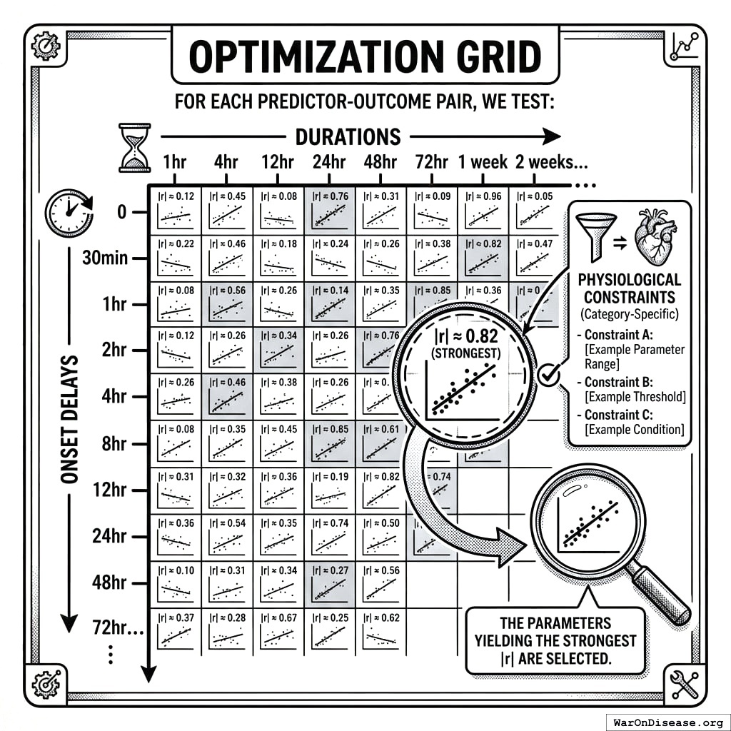
The parameters yielding the strongest |r| are selected, subject to category-specific physiological constraints.
Overfitting Protection
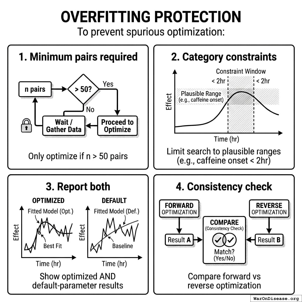
To prevent spurious optimization: 1. Minimum pairs required: Only optimize if n > 50 pairs 2. Category constraints: Limit search to plausible ranges (e.g., caffeine onset < 2hr) 3. Report both: Show optimized AND default-parameter results 4. Consistency check: Compare forward vs reverse optimization
Spearman Rank Correlation
In addition to Pearson correlation, we compute Spearman rank correlation (forward_spearman_correlation_coefficient) for robustness:
\[r_s = 1 - \frac{6 \sum d_i^2}{n(n^2-1)}\]
Where \(d_i\) = difference in ranks for each pair.
Advantages over Pearson:
- Robust to outliers
- Captures monotonic (not just linear) relationships
- Less affected by skewed distributions
When to prefer Spearman:
- Outcome has skewed distribution (e.g., symptom severity with many zeros)
- Relationship is monotonic but non-linear (e.g., diminishing returns)
- Data contains outliers from measurement errors
Outcome Label Generation
Predictor Analysis Reports
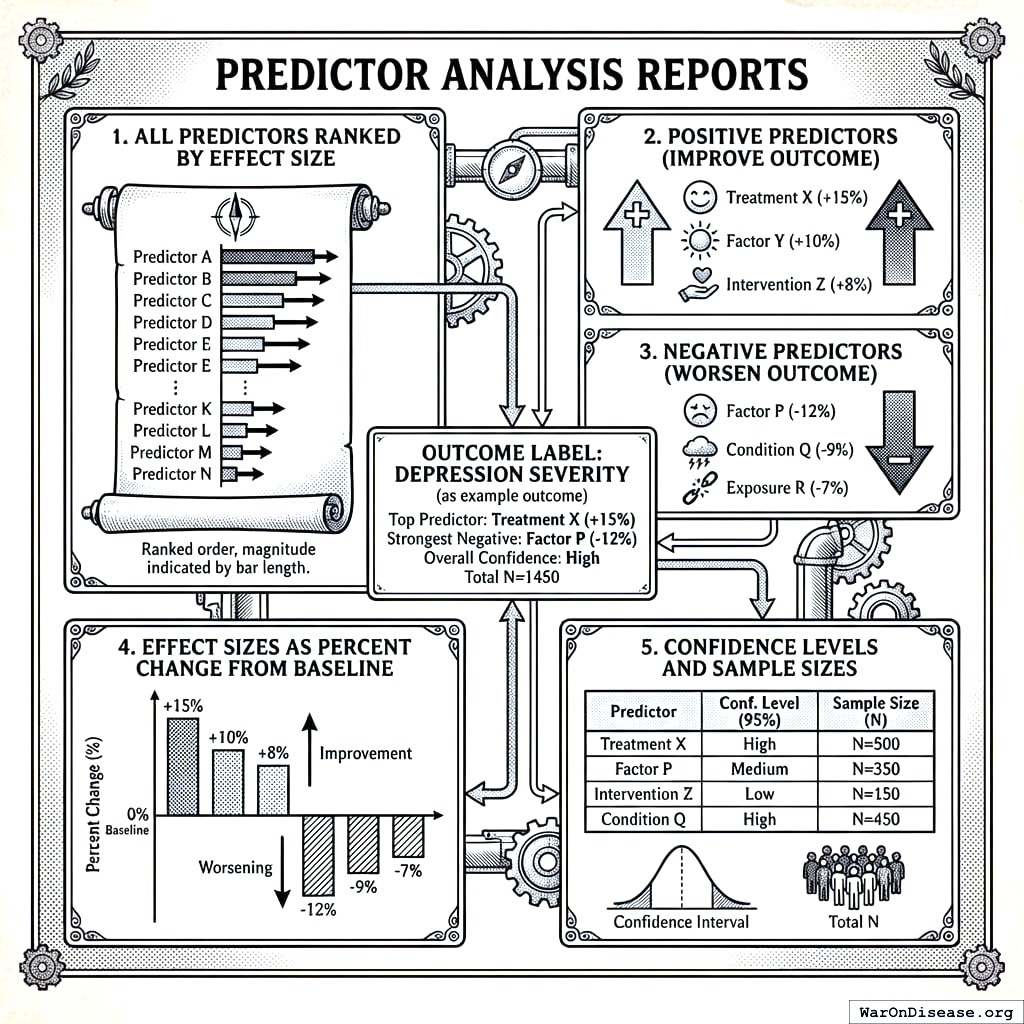
For each outcome variable (e.g., Depression Severity), we generate comprehensive “outcome labels” showing:
- All predictors ranked by effect size
- Positive predictors (treatments/factors that improve the outcome)
- Negative predictors (treatments/factors that worsen the outcome)
- Effect sizes as percent change from baseline
- Confidence levels and sample sizes
Report Structure
Outcome Label: [Outcome Variable Name]
Population: N = [number] participants
Total Studies: [number] treatment-outcome pairs analyzed

POSITIVE EFFECTS (Treatments predicting IMPROVEMENT)
================================================
Rank | Treatment | Effect Size | 95% CI | N | Confidence
-----|-----------|-------------|--------|---|------------
1    | Treatment A | +23.5% | [18.2, 28.8] | 1,247 | High
2    | Treatment B | +18.2% | [12.1, 24.3] | 892 | High
3    | Treatment C | +12.7% | [8.3, 17.1] | 2,103 | High
...

NEGATIVE EFFECTS (Treatments predicting WORSENING)
=================================================
Rank | Treatment | Effect Size | 95% CI | N | Confidence
-----|-----------|-------------|--------|---|------------
1    | Treatment X | -15.3% | [-20.1, -10.5] | 567 | Medium
2    | Treatment Y | -8.7% | [-12.3, -5.1] | 1,892 | High
...

NO SIGNIFICANT EFFECT
=====================
[List of treatments with |Δ| < threshold or p > 0.05]
Category-Specific Analysis
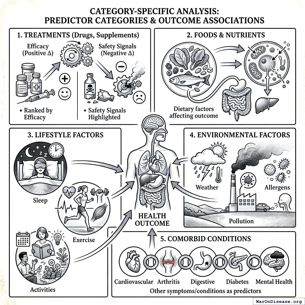
Reports are organized by predictor category:
- Treatments (Drugs, Supplements)
- Ranked by efficacy (positive Δ)
- Safety signals highlighted (negative Δ)
- Foods & Nutrients
- Dietary factors affecting outcome
- Lifestyle Factors
- Sleep, exercise, activities
- Environmental Factors
- Weather, pollution, allergens
- Comorbid Conditions
- Other symptoms/conditions as predictors
Verification Status
Each study is classified by verification status:
| Status | Icon | Description |
|---|---|---|
| Verified | ✓ | Up-voted by users; data reviewed and valid |
| Unverified | ? | Awaiting review |
| Flagged | ✗ | Down-voted; potential data quality issues |
Outcome Labels vs. FDA Drug Labels
Traditional FDA drug labels are per-drug documents that list qualitative adverse events and indications based on pre-market trials. They are static (updated infrequently), qualitative (“may cause drowsiness”), and organized around the drug rather than the patient’s condition.
Outcome Labels invert this paradigm: they are per-outcome documents that rank all treatments by quantitative effect size for a given health outcome. They are dynamic (updated continuously as data arrives), quantitative (“↓24.7% depression severity”), and organized around what the patient wants to optimize. This enables patients and clinicians to answer the question: “What works best for my condition?” This is a question traditional drug labels cannot answer.
Worked Example: Complete Outcome Label
The following shows a complete outcome label for depression, demonstrating how treatments are ranked by effect size with confidence intervals:
OUTCOME LABEL: Depression Severity
Based on 47,832 participants tracking depression outcomes Last updated: 2026-01-04 | Data period: 2020-2026
Treatments Improving Depression (ranked by effect size \(\Delta\))
| Rank | Treatment | Effect | 95% CI | N | PIS | Optimal Dose |
|---|---|---|---|---|---|---|
| 1 | Exercise | −31.2% | [27.1, 35.3] | 12,847 | 0.67 | 45 min/day |
| 2 | Bupropion | −28.3% | [22.1, 34.5] | 2,847 | 0.54 | 300mg |
| 3 | Sertraline | −24.7% | [19.8, 29.6] | 5,123 | 0.51 | 100mg |
| 4 | Sleep (7-9 hrs) | −22.1% | [18.4, 25.8] | 31,204 | 0.48 | 8.2 hrs |
| 5 | Venlafaxine | −21.2% | [15.3, 27.1] | 1,892 | 0.44 | 150mg |
| 6 | Omega-3 | −18.9% | [14.2, 23.6] | 4,521 | 0.38 | 2000mg EPA+DHA |
| 7 | Meditation | −16.4% | [12.1, 20.7] | 8,932 | 0.35 | 20 min/day |
| 8 | Fluoxetine | −15.8% | [11.2, 20.4] | 3,456 | 0.33 | 40mg |
| 9 | Vitamin D | −12.3% | [8.7, 15.9] | 6,789 | 0.28 | 4000 IU |
| 10 | Social interaction | −11.7% | [8.2, 15.2] | 9,234 | 0.26 | 3+ hrs/day |
Treatments Worsening Depression (safety signals)
| Rank | Treatment | Effect | 95% CI | N | PIS | Note |
|---|---|---|---|---|---|---|
| 1 | Alcohol (>2/day) | +23.4% | [18.9, 27.9] | 7,234 | 0.52 | Dose-dependent |
| 2 | Sleep deprivation | +19.8% | [15.2, 24.4] | 14,521 | 0.47 | <6 hrs/night |
| 3 | Social isolation | +15.2% | [11.3, 19.1] | 5,892 | 0.38 | <1 hr/day |
| 4 | Refined sugar | +8.7% | [5.2, 12.2] | 11,234 | 0.24 | >50g/day |
No Significant Effect (\(|\Delta| < 5\%\) or \(p > 0.05\)): Multivitamin, Probiotics, B-complex, Magnesium (for depression specifically), Ashwagandha, 5-HTP, SAMe, St. John’s Wort1
Legend: PIS = Predictor Impact Score (0-1 scale, higher = stronger evidence); Optimal Dose = \(V_{high}\) for positive valence outcomes and \(V_{low}\) for negative valence outcomes
Interpretation: This outcome label shows that for depression, exercise and sleep optimization rival or exceed pharmaceutical interventions in effect size, with stronger evidence bases (higher N). Bupropion and Sertraline lead among medications. The safety signals section highlights modifiable risk factors that worsen depression.
Treatment Ranking System
Within-Category Rankings
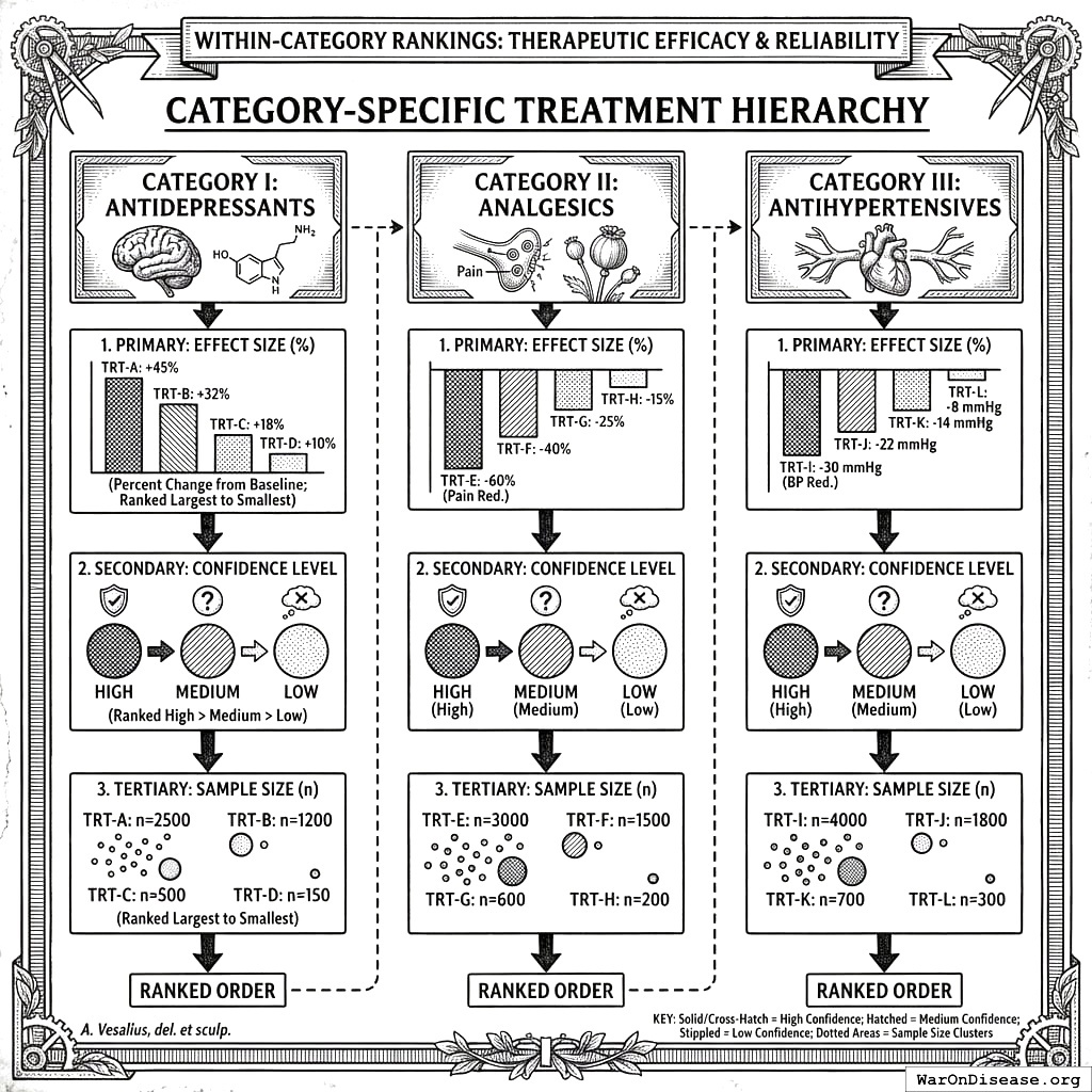
For each therapeutic category (e.g., Antidepressants), treatments are ranked by:
- Primary: Effect size (percent change from baseline)
- Secondary: Confidence level (High > Medium > Low)
- Tertiary: Sample size
Ranking Algorithm
For each treatment \(T\) in a therapeutic category, we compute a composite ranking score:
\[\text{RankScore}_T = \bar{\Delta}_T \times w_{\text{confidence}} \times \text{PIS}_T\]
where \(\bar{\Delta}_T\) is the mean effect size across participants, \(w_{\text{confidence}}\) is the confidence weight (see Table 115.3), and \(\text{PIS}_T\) is the Predictor Impact Score. Treatments are sorted by descending rank score.
Confidence Weighting
| Confidence Level | Weight (\(w\)) | Criteria |
|---|---|---|
| High | 1.0 | \(p < 0.01\) OR \(N > 100\) OR pairs \(> 500\) |
| Medium | 0.7 | \(p < 0.05\) OR \(N > 10\) OR pairs \(> 100\) |
| Low | 0.4 | Meets minimum thresholds only |
Comparative Effectiveness Display
Table 115.4 illustrates how treatments within a therapeutic category are presented to users.
| Rank | Treatment | Effect (\(\Delta\)) | 95% CI | N | Confidence |
|---|---|---|---|---|---|
| 1 | Bupropion 300mg | −28.3% | [22.1, 34.5] | 2,847 | High |
| 2 | Sertraline 100mg | −24.7% | [19.8, 29.6] | 5,123 | High |
| 3 | Venlafaxine 150mg | −21.2% | [15.3, 27.1] | 1,892 | High |
| 4 | Fluoxetine 40mg | −18.9% | [13.2, 24.6] | 3,456 | High |
Safety and Efficacy Quantification
Safety Signal Detection
Adverse Effect Identification: Safety signals are identified through (1) negative correlations between treatment and beneficial outcomes, and (2) positive correlations between treatment and harmful outcomes.
| Outcome | Effect (\(\Delta\)) | 95% CI | Plausibility | Action |
|---|---|---|---|---|
| Fatigue | +18.3% | [12.1, 24.5] | High (known sedation) | Monitor |
| Nausea | +15.7% | [8.9, 22.5] | High (GI effects) | Monitor |
| Weight Gain | +8.2% | [4.1, 12.3] | Medium | Long-term monitoring |
| Anxiety | +6.5% | [2.1, 10.9] | Low (paradoxical) | Investigate |
Efficacy Signal Detection
Therapeutic Effect Identification: Efficacy signals are identified through (1) positive correlations between treatment and beneficial outcomes, and (2) negative correlations between treatment and harmful outcomes (symptom reduction).
| Outcome | Effect (\(\Delta\)) | 95% CI | Indication | Evidence |
|---|---|---|---|---|
| Depression | −24.7% | [19.8, 29.6] | Primary | Strong |
| Anxiety | −18.2% | [12.3, 24.1] | Secondary | Strong |
| Sleep Quality | +15.3% | [10.1, 20.5] | Secondary | Moderate |
| Energy | +12.1% | [7.2, 17.0] | Secondary | Moderate |
Benefit-Risk Assessment
Net Clinical Benefit Score:
\[\text{NCB} = \sum_{i \in \text{benefits}} w_i \cdot |\Delta_i| - \sum_{j \in \text{risks}} w_j \cdot |\Delta_j|\]
where \(w\) represents importance weights assigned by clinical relevance.
Example: Sertraline 100mg Benefit-Risk Profile
| Benefits | Effect | Weight | Risks | Effect | Weight |
|---|---|---|---|---|---|
| Depression | −24.7% | 1.0 | Nausea | +8.3% | 0.3 |
| Anxiety | −18.2% | 0.8 | Insomnia | +5.1% | 0.4 |
| Sexual dysfunction | +12.7% | 0.5 |
Weighted Summary: Benefits = 39.26, Risks = 8.93, Net Clinical Benefit = +30.33 (favorable profile for depression/anxiety)
Addressing the Bradford Hill Criteria
The Bradford Hill criteria171 provide the foundational framework for assessing causation from observational data. This section details how our framework addresses each criterion.
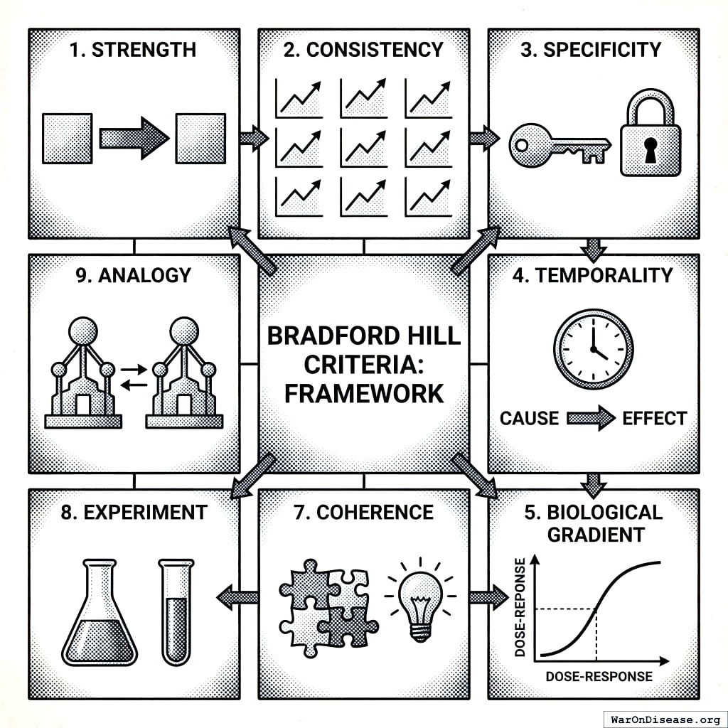
Complete Criteria Mapping
| Criterion | How Addressed | Quantitative Metric | In PIS? |
|---|---|---|---|
| Strength | Effect size magnitude | Pearson \(r\), \(\Delta\)% | Yes |
| Consistency | Cross-participant aggregation | \(N\), \(n\), SE, CI | Yes |
| Specificity | Category appropriateness | Interest factor | Yes |
| Temporality | Onset delay requirement | \(\delta > 0\) enforced | Yes |
| Biological Gradient | Dose-response analysis | Gradient coefficient | Yes |
| Plausibility | Community voting | Up/down votes | Yes |
| Coherence | Literature cross-reference | Narrative | No |
| Experiment | N-of-1 natural experiments | Study design | No |
| Analogy | Similar variable comparison | Narrative | No |
Quantitative Criteria Details
Strength:
- Reports Pearson \(r\) with classification (very strong: ≥0.8, strong: ≥0.6, moderate: ≥0.4, weak: ≥0.2, very weak: <0.2)
- Example: “There is a moderately positive (R = 0.45) relationship between Sertraline and Depression improvement.”
Consistency:
- Reports \(N\) participants, \(n\) paired measurements
- Notes that spurious associations naturally dissipate as participants modify behaviors based on non-replicating findings
Temporality:
- Onset delay \(\delta\) explicitly encodes treatment-to-effect lag
- Forward vs. reverse correlation comparison identifies potential reverse causality
Plausibility:
- Users vote on biological mechanism plausibility
- Weighted average contributes to ranking
- Crowd-sources expert and patient knowledge
Validation and Quality Assurance
User Voting System
Each study can receive user votes:
| Vote | Meaning | Effect |
|---|---|---|
| Up-vote (+1) | Data appears valid, relationship plausible | Included in verified results |
| Down-vote (-1) | Data issues or implausible relationship | Flagged for review |
| No vote | Not yet reviewed | Included in unverified results |
Automated Quality Checks
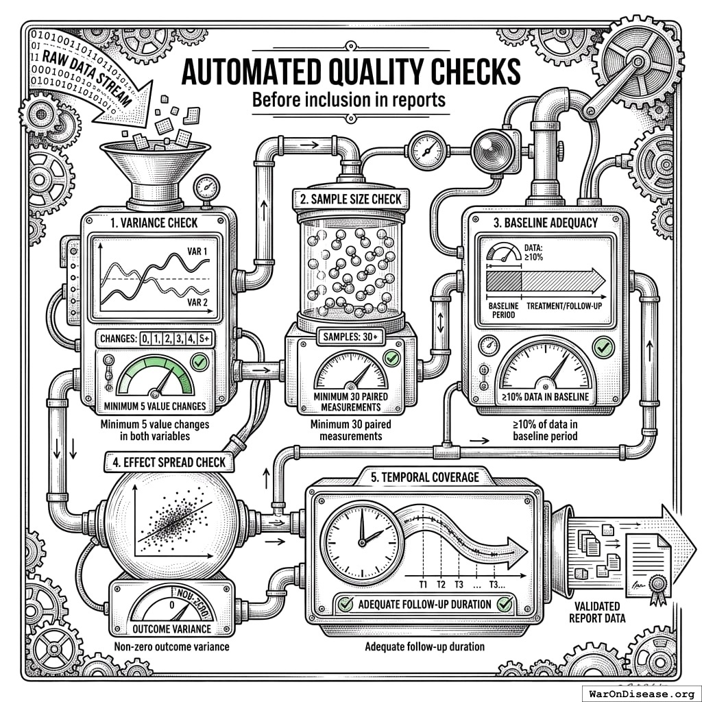
Before inclusion in reports:
- Variance check: Minimum 5 value changes in both variables
- Sample size check: Minimum 30 paired measurements
- Baseline adequacy: ≥10% of data in baseline period
- Effect spread check: Non-zero outcome variance
- Temporal coverage: Adequate follow-up duration
Flagged Study Handling
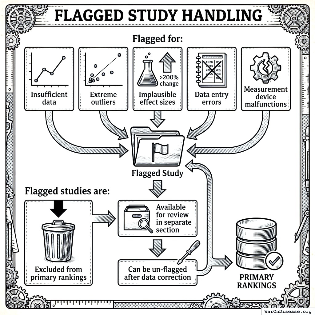
Studies may be flagged for:
- Insufficient data
- Extreme outliers
- Implausible effect sizes (>200% change)
- Data entry errors
- Measurement device malfunctions
Flagged studies are:
- Excluded from primary rankings
- Available for review in separate section
- Can be un-flagged after data correction
Stage 2: Pragmatic Trial Confirmation
The short version: Observational data can find promising signals, but only randomized trials can prove causation. The good news: we don’t need expensive, slow traditional trials. A meta-analysis of 108 embedded pragmatic trials166 shows that “pragmatic” trials (simple randomization embedded in routine care) can validate treatments at 44.1x (95% CI: 39.4x-89.1x) lower cost. We use cheap observational analysis (Stage 1) to filter millions of possibilities down to the top candidates, then confirm the best ones with pragmatic trials (Stage 2). Result: validated treatment recommendations at a fraction of current cost.
The observational methodology described in Sections 1-11 generates ranked hypotheses about treatment-outcome relationships. While powerful for signal detection and hypothesis generation, observational data alone cannot establish causation due to unmeasured confounding. This section describes how pragmatic clinical trials serve as the confirmation layer, transforming promising observational signals into validated causal relationships.
The Two-Stage Pipeline
Our complete methodology operates as a two-stage pipeline:
| Stage | Method | Cost | Purpose | Output |
|---|---|---|---|---|
| Stage 1: Signal Detection | Aggregated N-of-1 observational analysis | ~$0.1 (95% CI: $0.03-$1)/patient | Hypothesis generation | Ranked PIS signals |
| Stage 2: Causal Confirmation | Pragmatic randomized trials | ~$929 (95% CI: $97-$3,000)/patient | Causation proof | Validated effect sizes |
This design leverages the complementary strengths of each approach:
- Stage 1 scales to millions of treatment-outcome pairs at minimal cost, identifying the most promising candidates
- Stage 2 applies experimental rigor to confirm causation for high-priority signals
Pragmatic Trial Methodology
Pragmatic trials differ fundamentally from traditional Phase III trials. A Harvard meta-analysis of 108 embedded pragmatic trials found median costs of only $97/patient, with even conservative implementations like ADAPTABLE achieving $929 (95% CI: $929-$1,400)/patient1,166:
| Dimension | Traditional Phase III | Pragmatic Trial (Evidence-Based) |
|---|---|---|
| Cost per patient | $929 (95% CI: $97-$3,000) (median $97-929)2 | |
| Time to results | 3-7 years | 3-6 months |
| Patient population | Homogeneous (strict exclusion) | Real-world (minimal exclusion) |
| Setting | Specialized research centers | Routine clinical care |
| Data collection | Extensive case report forms | Minimal essential outcomes |
| Randomization | Complex stratification | Simple 1:1 or 1:1:1 |
| Sample size | Hundreds to thousands | Thousands to tens of thousands |
Multiple large-scale pragmatic trials have demonstrated this model’s effectiveness. The Oxford RECOVERY trial enrolled 49,000 patients across 186 hospitals, evaluating 12 treatments and finding a life-saving result (dexamethasone) in 100 days, saving 1 million lives (95% CI: 500 thousand lives-2 million lives) globally114. The PCORnet ADAPTABLE trial enrolled 15,076 patients across 40 clinical sites at $929 (95% CI: $929-$1,400)/patient1. These are not isolated successes. The Harvard meta-analysis shows this efficiency is reproducible across therapeutic areas166.
Signal-to-Trial Prioritization
Not all observational signals warrant pragmatic trial confirmation. We propose a Trial Priority Score (TPS) combining:
\[TPS = PIS \times \sqrt{\mathrm{DALYs}_{\text{addressable}}} \times \text{Novelty} \times \text{Feasibility}\]
Where:
- PIS: Predictor Impact Score from Stage 1 (higher = stronger signal)
- \(\mathrm{DALYs}_{\text{addressable}}\): Disease burden addressable by the treatment
- Novelty: Inverse of existing evidence (new signals prioritized)
- Feasibility: Practical considerations (drug availability, safety profile, cost)
Signals in the top 0.1-1% by TPS are candidates for pragmatic trial confirmation.
Comparative Effectiveness Randomization
For treatments already in clinical use, we employ comparative effectiveness designs following the ADAPTABLE trial model1:
- Embedded randomization: Randomization occurs within routine care visits
- Minimal disruption: Patients receive standard care with random assignment between active comparators
- Real-world endpoints: Primary outcomes are events captured in EHR (mortality, hospitalization, symptom resolution)
- Large simple design: Thousands of patients, minimal per-patient data collection
Example protocol for a high-PIS signal (Treatment A vs. Treatment B for Outcome X):
| Parameter | Specification |
|---|---|
| Eligibility | Patients with Condition Y initiating treatment for Outcome X |
| Randomization | 1:1 to Treatment A vs. Treatment B |
| Primary endpoint | Change in Outcome X at 90 days |
| Data collection | Baseline characteristics (EHR), outcome at 90 days (patient-reported or EHR) |
| Sample size | 2,000 patients (1,000 per arm) |
| Cost | ~$1.9M total ($929 (95% CI: $97-$3,000)/patient) |
| Timeline | 6-12 months |
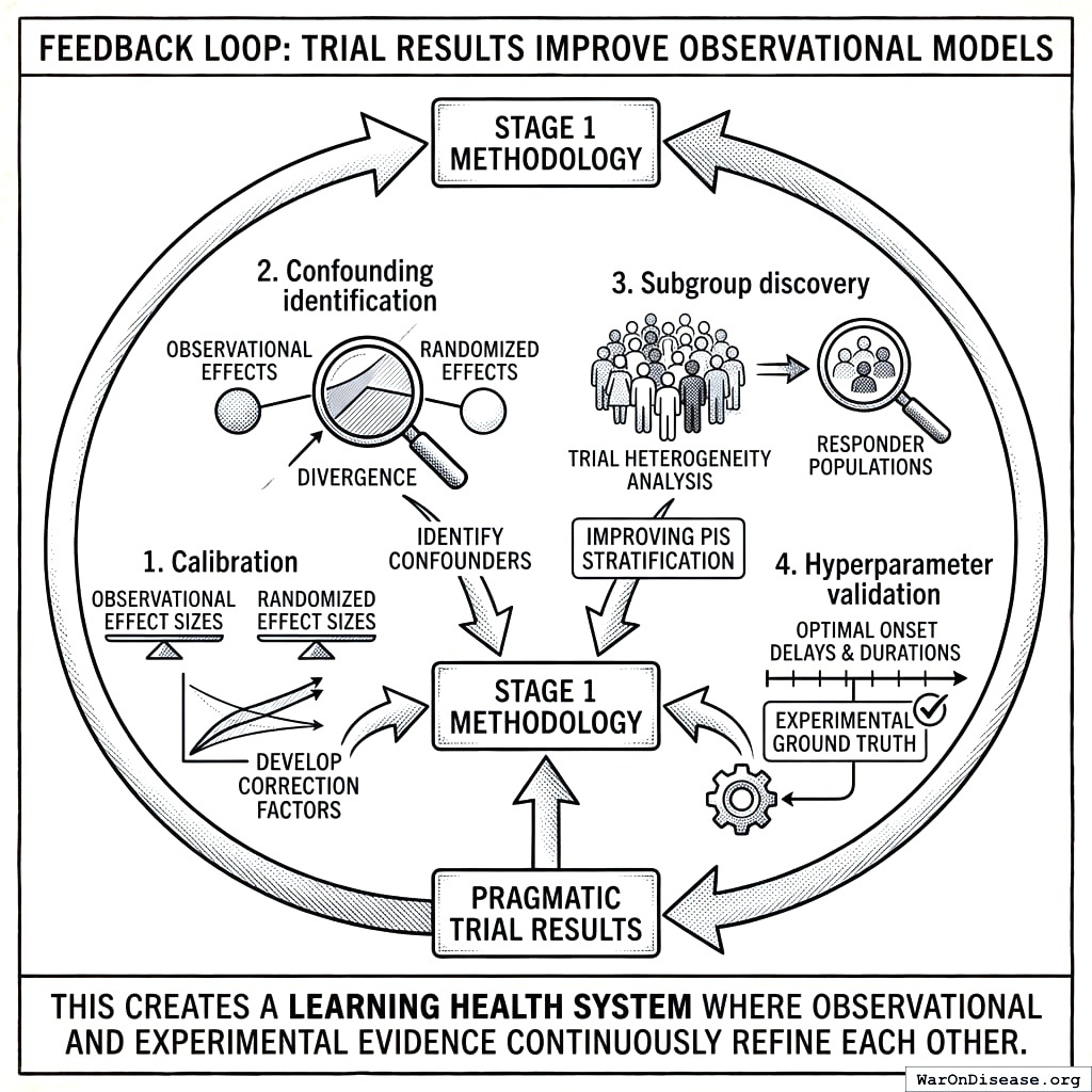
Feedback Loop: Trial Results Improve Observational Models
Pragmatic trial results feed back to improve Stage 1 methodology:
- Calibration: Compare observational effect sizes to randomized effect sizes; develop correction factors
- Confounding identification: Trials where observational and randomized effects diverge identify confounders
- Subgroup discovery: Trial heterogeneity analysis identifies responder populations, improving PIS stratification
- Hyperparameter validation: Optimal onset delays and durations validated against experimental ground truth
This creates a learning health system where observational and experimental evidence continuously refine each other.
Output: Validated Outcome Labels
The two-stage pipeline produces validated outcome labels combining observational and experimental evidence. Table 115.11 shows the data elements captured for each treatment-outcome pair.
| Component | Field | Description | Example |
|---|---|---|---|
| Identification | Treatment | Intervention name and dose | Vitamin D 2000 IU |
| Outcome | Health outcome measured | Depression Severity | |
| Stage 1 (Observational) | \(\Delta_{obs}\) | Observational effect size | −12% |
| \(\text{CI}_{obs}\) | 95% confidence interval | [−15%, −9%] | |
| \(N_{obs}\) | Number of participants | 45,000 | |
| PIS | Predictor Impact Score | 0.72 | |
| Stage 2 (Experimental) | \(\Delta_{exp}\) | Randomized trial effect | −8% |
| \(\text{CI}_{exp}\) | Trial confidence interval | [−12%, −4%] | |
| \(N_{exp}\) | Trial participants | 3,000 | |
| Trial ID | Registry identifier | DFDA-VIT-D-001 | |
| Combined | Evidence Grade | Validation status | Validated/Promising/Signal |
| Causal Confidence | Probability of true effect | 0-1 scale |
Evidence grades:
- Validated: Confirmed by pragmatic RCT (p < 0.05, consistent direction)
- Promising: High PIS (>0.6), awaiting or in trial
- Signal: Moderate PIS (0.3-0.6), hypothesis only
Limitations and How They’re Addressed
The two-stage design addresses the fundamental limitations of purely observational pharmacovigilance while acknowledging residual constraints.
Fundamental Limitations: Observational Stage
These limitations apply to Stage 1 (observational analysis) but are addressed by Stage 2 (pragmatic trials):
| Limitation | Stage 1 Status | Stage 2 Resolution |
|---|---|---|
| Cannot prove causation | Hypothesis only | Randomization establishes causation |
| Cannot replace RCTs | Generates candidates | Pragmatic trials ARE simplified RCTs |
| Cannot handle strong confounding | Confounding by indication | Randomization eliminates confounding |
| Cannot generalize beyond population | Self-selected trackers | Pragmatic trials use real-world populations |
Methodological Weaknesses: Addressed by Two-Stage Design
| Weakness | Stage 1 Impact | Two-Stage Resolution |
|---|---|---|
| Arbitrary baseline definition | Acceptable for signal ranking | Trial uses randomized comparison, no baseline needed |
| Hyperparameter overfitting | May inflate some correlations | Trial confirms true effect, calibrates models |
| Self-selection bias | Non-representative sample | Pragmatic trials embed in routine care |
| Measurement error | Self-report limitations | Trials can use objective endpoints |
| Hawthorne effect | Tracking changes behavior | Trials embedded in normal care minimize this |
| Multiple testing | Millions of comparisons | Only top signals proceed to trial (TPS filter) |
| Temporal confounding | Seasonal/life event effects | Randomization eliminates systematic bias |
| Confounding by indication | Sicker patients take more treatment | Randomization balances severity |
Residual Limitations
Even with the two-stage design, certain limitations remain:
- Resource constraints: Cannot trial all promising signals; prioritization required
- External validity: Pragmatic trial populations still may not represent all subgroups
- Rare outcomes: Very rare adverse events may require larger observational signals
- Behavioral interventions: Some treatments (diet, exercise) difficult to blind
- Long-term effects: Pragmatic trials typically 6-12 months; decades-long effects require observational follow-up
- Interaction effects: Two-way drug interactions testable; higher-order interactions remain observational
- Multiple testing burden: Stage 1 analyzes millions of treatment-outcome pairs without formal multiple testing correction (e.g., Benjamini-Hochberg FDR control). The TPS filter reduces false positives proceeding to Stage 2, but users should expect a high proportion of Stage 1 signals to be false discoveries. This is by design (cheap observational analysis tolerates false positives because Stage 2 trials filter them out), but consumers of Stage 1 rankings alone should interpret with appropriate skepticism
- Self-selection bias: Participants who track health data differ systematically from the general population (likely healthier, more educated, more health-conscious). Effect sizes may not generalize to non-trackers
What This Framework CAN Now Do
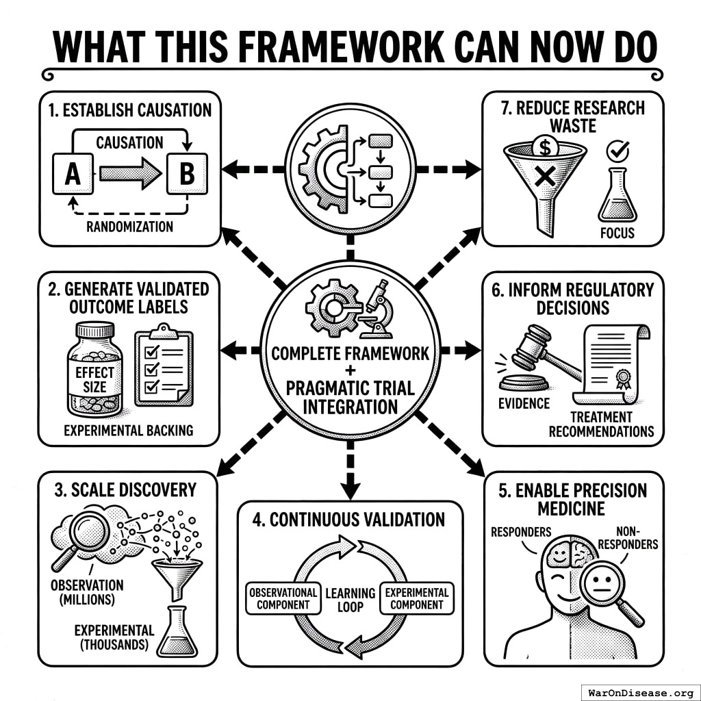
With pragmatic trial integration, the complete framework can:
- Establish causation: For high-priority signals, randomization proves causal relationships
- Generate validated outcome labels: Quantitative effect sizes with experimental backing
- Scale discovery: Analyze millions of pairs observationally, confirm thousands experimentally
- Continuous validation: Learning loop improves both observational and experimental components
- Enable precision medicine: Subgroup analyses identify responders vs. non-responders
- Inform regulatory decisions: Validated labels provide evidence for treatment recommendations
- Reduce research waste: Focus expensive trials on signals most likely to confirm
Implementation Guide
System Architecture
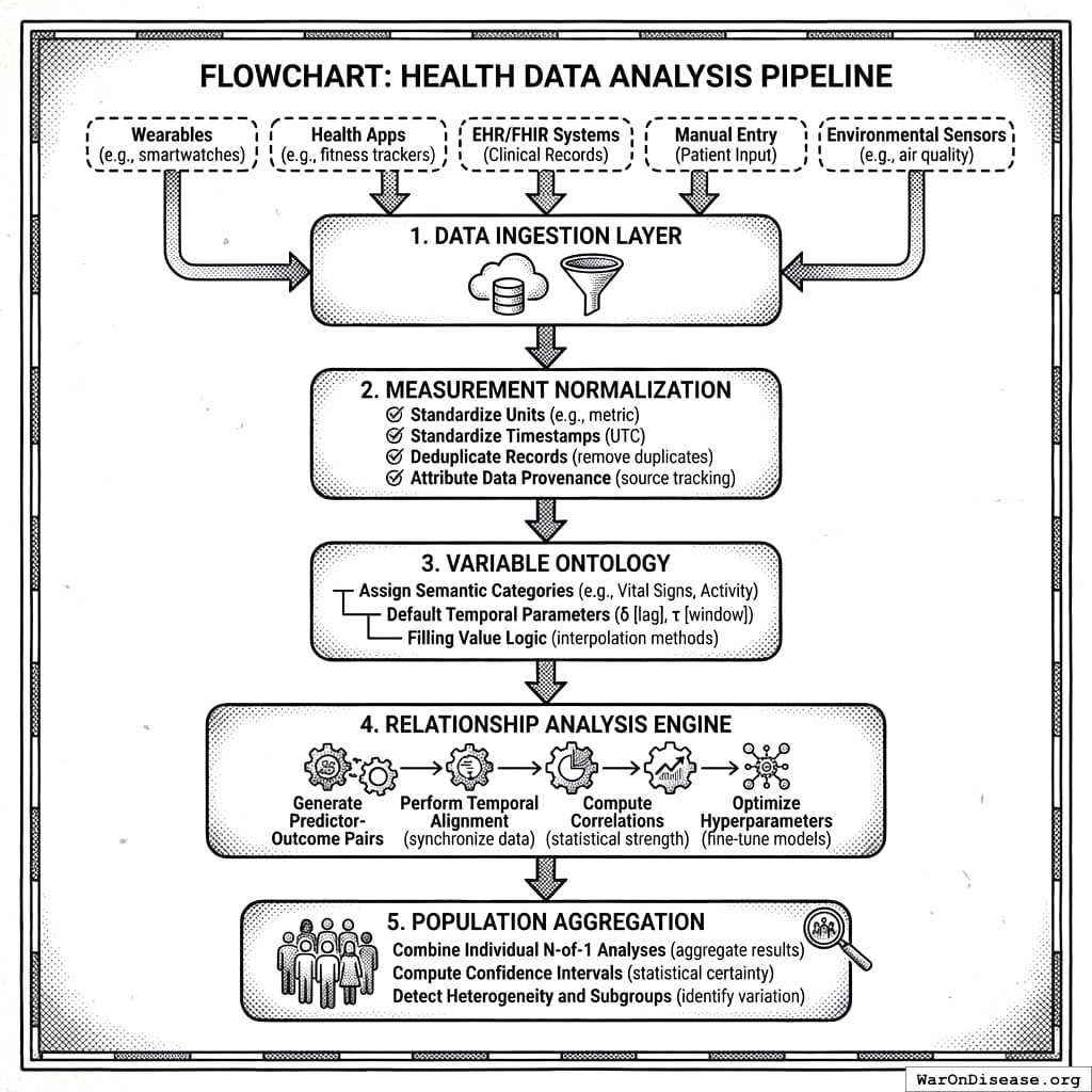
The processing protocol defines six sequential steps:
- Data Ingestion Protocol: Collects measurements from wearables, health apps, EHR/FHIR systems, manual entry, and environmental sensors
- Measurement Normalization: Standardizes units, timestamps, deduplicates records, and attributes data provenance
- Variable Ontology: Assigns semantic categories, default temporal parameters (\(\delta\), \(\tau\)), and filling value logic
- Relationship Analysis Engine: Generates predictor-outcome pairs, performs temporal alignment, computes correlations, and optimizes hyperparameters
- Population Aggregation: Combines individual N-of-1 analyses, computes confidence intervals, detects heterogeneity and subgroups
- Report Generation: Produces outcome labels, treatment rankings, and safety/efficacy signals
Complete implementation details, database schemas, and reference code are available in the supplementary materials repository.
Core Algorithm: Pair Generation
Algorithm 1 (Temporal Pair Generation): Given predictor measurements \(P = \{(t_j^P, p_j)\}\) and outcome measurements \(O = \{(t_k^O, o_k)\}\), onset delay \(\delta\), duration of action \(\tau\), and optional filling value \(f\):
Case 1 (Predictor has filling value): For each outcome measurement \((t_k^O, o_k)\): \[p_k = \begin{cases} \frac{1}{|W_k|}\sum_{j \in W_k} p_j & \text{if } W_k \neq \emptyset \\ f & \text{otherwise} \end{cases}\] where \(W_k = \{j : t_k^O - \delta - \tau < t_j^P \leq t_k^O - \delta\}\). Output pair \((p_k, o_k)\).
Case 2 (No filling value): For each predictor measurement \((t_j^P, p_j)\): \[o_j = \frac{1}{|W_j|}\sum_{k \in W_j} o_k\] where \(W_j = \{k : t_j^P + \delta \leq t_k^O < t_j^P + \delta + \tau\}\). Output pair \((p_j, o_j)\) only if \(W_j \neq \emptyset\).
Core Algorithm: Baseline Separation
Algorithm 2 (Baseline/Follow-up Partition): Given aligned pairs \(\{(p_i, o_i)\}_{i=1}^n\):
- Compute predictor mean: \(\bar{p} = \frac{1}{n}\sum_{i=1}^n p_i\)
- Partition into baseline \(B = \{(p_i, o_i) : p_i < \bar{p}\}\) and follow-up \(F = \{(p_i, o_i) : p_i \geq \bar{p}\}\)
- Compute outcome means: \(\mu_B = \mathbb{E}[o \mid (p,o) \in B]\) and \(\mu_F = \mathbb{E}[o \mid (p,o) \in F]\)
- Return percent change: \(\Delta = \frac{\mu_F - \mu_B}{\mu_B} \times 100\)
Algorithm 3: Predictor Impact Score Calculation
Algorithm 3 (User-Level PIS): Given correlation coefficients, statistical significance, z-score, interest factor, and aggregate PIS:
\[\text{PIS}_{\text{user}} = |r| \times S \times \phi_z \times \phi_{\text{temporal}} \times f_{\text{interest}} + \text{PIS}_{\text{agg}}\]
Procedure:
- Set \(Z_{\text{ref}} = 2\) (reference z-score threshold)
- Compute strength: \(r = |r_{\text{forward}}|\)
- Compute effect magnitude factor: \(\phi_z = \frac{|z|}{|z| + Z_{\text{ref}}}\) (or 0.5 if z undefined)
- Compute temporality factor: \(\phi_{\text{temporal}} = \frac{|r_{\text{forward}}|}{|r_{\text{forward}}| + |r_{\text{reverse}}|}\) (or 0.5 if both zero)
- Return: \(r \times S \times \phi_z \times \phi_{\text{temporal}} \times f_{\text{interest}} + \text{PIS}_{\text{agg}}\)
Algorithm 4 (Aggregate PIS): Given forward correlation, number of users \(N\), number of pairs \(n\), outcome changes, plausibility votes, and gradient coefficient:
\[\text{PIS}_{\text{agg}} = |r_{\text{forward}}| \times w \times \phi_{\text{users}} \times \phi_{\text{pairs}} \times \phi_{\text{change}} \times \phi_{\text{gradient}}\]
Procedure:
- Set saturation constants: \(N_{\text{sig}} = 10\), \(n_{\text{sig}} = 100\), \(\Delta_{\text{sig}} = 10\%\)
- Compute user saturation: \(\phi_{\text{users}} = 1 - e^{-N/N_{\text{sig}}}\)
- Compute pair saturation: \(\phi_{\text{pairs}} = 1 - e^{-n/n_{\text{sig}}}\)
- Compute change spread: \(\Delta_{\text{spread}} = |\Delta_{\text{high}} - \Delta_{\text{low}}|\) (minimum 1)
- Compute change saturation: \(\phi_{\text{change}} = 1 - e^{-\Delta_{\text{spread}}/\Delta_{\text{sig}}}\)
- Compute gradient factor: \(\phi_{\text{gradient}} = \min(\text{gradient\_coefficient}, 1.0)\)
- Return: \(|r_{\text{forward}}| \times w \times \phi_{\text{users}} \times \phi_{\text{pairs}} \times \phi_{\text{change}} \times \phi_{\text{gradient}}\)
Algorithm 5 (Interest Factor): Penalize spurious variable pairs:
\[f_{\text{interest}} = f_P \times f_O \times f_{\text{pair}}\]
Procedure:
- Initialize \(f = 1.0\)
- Predictor penalties: Divide \(f\) by 2 for each: test variable, app/website, address
- Outcome penalties: Divide \(f\) by 2 for each: test variable, non-outcome category
- Pair penalties: Divide \(f\) by 2 if predictor is non-predictor category; divide by 10 if illogical category pair
- Return \(f\)
Reference Implementation
A complete reference implementation is available at:
- Code Repository: https://github.com/decentralized-fda
- Documentation: https://docs.dfda.earth
The repository includes:
- Analysis engine (Python) with full PIS calculation pipeline
- Database schemas (PostgreSQL, SQLite) for variable relationships
- API protocol (OpenAPI 3.0) for data ingestion and querying
- Test vectors matching Appendix D worked example
Regulatory Considerations
Positioning Relative to RCTs
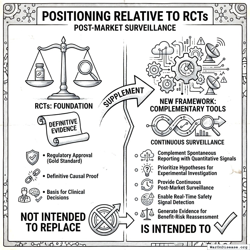
This framework is not intended to:
- Replace RCTs for regulatory approval
- Provide definitive causal proof
- Serve as sole basis for clinical decisions
This framework is intended to:
- Complement spontaneous reporting with quantitative signals
- Prioritize hypotheses for experimental investigation
- Provide continuous post-market surveillance
- Enable real-time safety signal detection
- Generate evidence for benefit-risk reassessment
Evidence Hierarchy Integration
| Evidence Level | Source | Role of This Framework |
|---|---|---|
| Level I | RCTs, Meta-analyses | Gold standard for approval |
| Level II | Cohort studies | This framework provides quantitative RWE |
| Level III | Case-control | Traditional pharmacovigilance |
| Level IV | Case series | Spontaneous reports (FAERS) |
FDA Real-World Evidence Framework Alignment

The 21st Century Cures Act mandates FDA evaluation of RWE. This framework supports:
- FDA Sentinel System: Provides complementary patient-reported data
- Post-market commitments: Continuous safety monitoring
- Label updates: Quantitative basis for efficacy/safety updates
- Comparative effectiveness: Treatment rankings within classes
Validation Framework
The Critical Question
The ultimate test of PIS validity: Do high-PIS relationships replicate in RCTs more often than low-PIS ones?
Until this validation is performed, PIS should be treated as a theoretically-motivated heuristic, not a validated predictive tool.
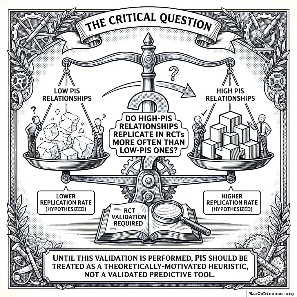
Proposed Validation Study
Design: Retrospective comparison of PIS predictions against published RCT results.
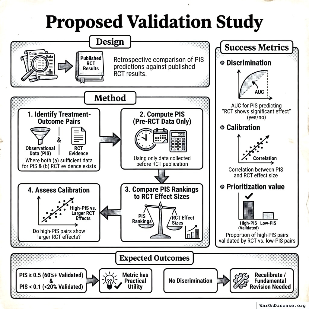
Method: 1. Identify treatment-outcome pairs where both (a) we have sufficient observational data to compute PIS, and (b) RCT evidence exists 2. Compute PIS for each pair using only data collected before RCT publication 3. Compare PIS rankings to RCT effect sizes 4. Assess calibration: Do high-PIS pairs show larger RCT effects?
Success Metrics:
- Discrimination: AUC for PIS predicting “RCT shows significant effect” (yes/no)
- Calibration: Correlation between PIS and RCT effect size
- Prioritization value: Proportion of high-PIS pairs validated by RCT vs. low-PIS pairs
Expected Outcomes:
- If PIS \(\geq 0.5\) pairs have RCT validation rate of 60%+ and PIS \(< 0.1\) pairs have rate < 20%, the metric has practical utility
- If no discrimination, saturation constants need recalibration or the approach needs fundamental revision
Known Limitations Requiring Validation
- Confounding by indication: Does the temporality factor adequately address reverse causation in treatment contexts?
- Saturation constant sensitivity: How robust are rankings to ±50% changes in N_sig, n_sig?
- Population generalizability: Do PIS values from health-tracker users predict effects in general populations?
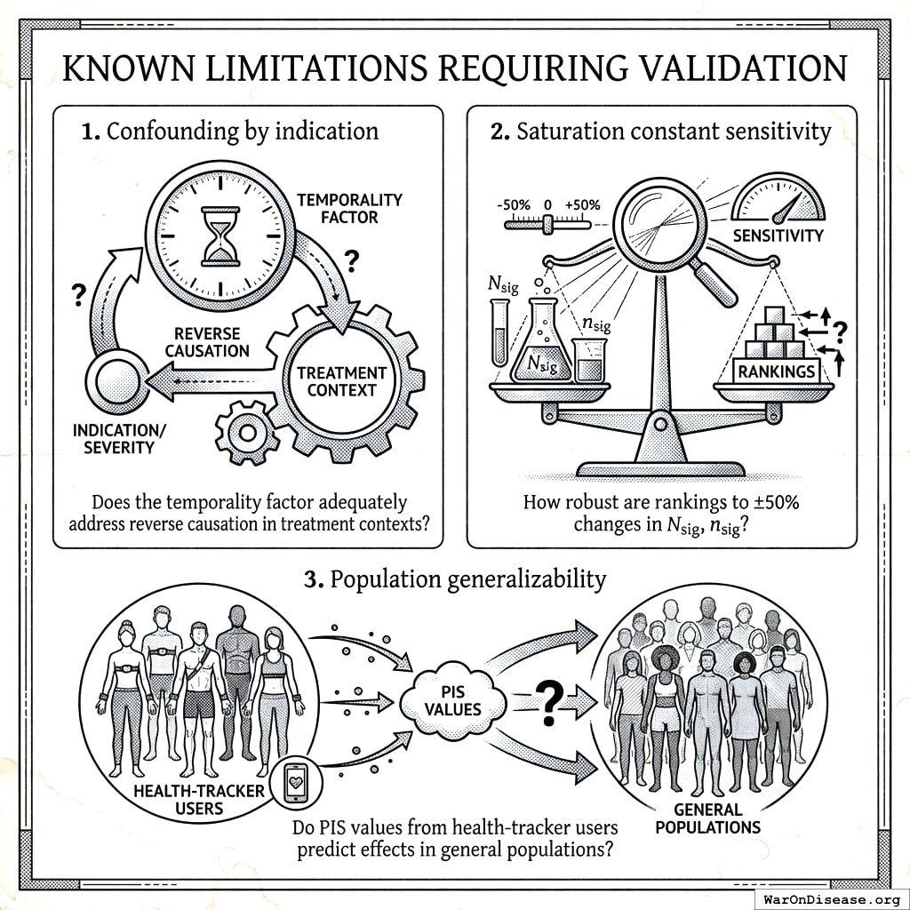
Future Directions
Methodological Improvements
- Causal discovery algorithms: Implement PC algorithm, FCI, or GES for graph structure learning
- Propensity score integration: Covariate adjustment for measured confounders
- Bayesian hierarchical models: More principled cross-participant pooling with uncertainty quantification
- Time-varying effects: Model how relationships change over time (effect modification)
- Subgroup analysis: Identify responder vs. non-responder populations using heterogeneity metrics
- Multiple testing correction: Benjamini-Hochberg for family-wise error control across millions of pairs
- Sensitivity analysis: E-values or other methods to quantify robustness to unmeasured confounding
- Causal mediation: Identify mechanisms through which treatments affect outcomes
- Drug-drug interactions: Detect combination effects and synergies
Validation Priorities
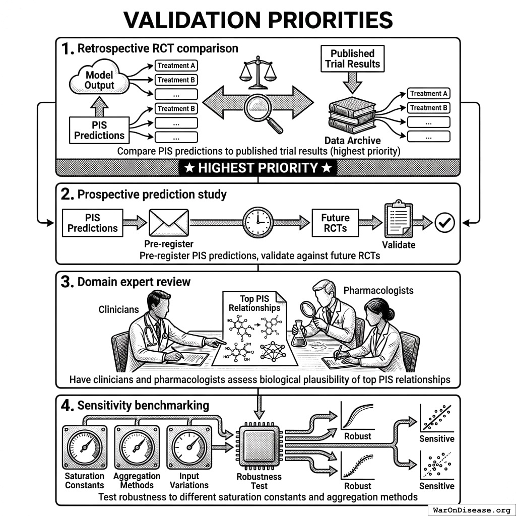
- Retrospective RCT comparison: Compare PIS predictions to published trial results (highest priority)
- Prospective prediction study: Pre-register PIS predictions, validate against future RCTs
- Domain expert review: Have clinicians and pharmacologists assess biological plausibility of top PIS relationships
- Sensitivity benchmarking: Test robustness to different saturation constants and aggregation methods
Implementation Enhancements
- Real-time signal detection: Automated alerts when new high-PIS relationships emerge
- Confidence intervals for PIS: Bootstrap or Bayesian intervals to quantify uncertainty
- Interactive exploration: Tools for users to explore their individual PIS relationships
- API access: Enable researchers to query PIS data programmatically
Conclusion
We have presented a comprehensive two-stage framework for generating validated outcome labels from real-world health data. Key contributions include:
- Stage 1: Scalable signal detection: Aggregated N-of-1 observational analysis processes millions of treatment-outcome pairs at ~$0.1 (95% CI: $0.03-$1)/patient, generating ranked hypotheses through the Predictor Impact Score
- Stage 2: Causal confirmation: Pragmatic randomized trials following the embedded trial model (validated across 108+ studies166) confirm top signals at ~$929 (95% CI: $97-$3,000)/patient (44.1x (95% CI: 39.4x-89.1x) cheaper than traditional trials) while eliminating confounding
- Bradford Hill operationalization: Six of nine causality criteria quantified in composite scoring system
- Trial Priority Score: Principled prioritization of which signals warrant experimental confirmation
- Validated outcome labels: Three-tier evidence grading (Validated, Promising, Signal) with both observational and experimental effect sizes
- Learning health system: Feedback loop where trial results continuously calibrate observational models
This two-stage design directly addresses the fundamental limitations of purely observational pharmacovigilance. Confounding by indication, self-selection bias, and inability to prove causation are all resolved through Stage 2 randomization for high-priority signals, while Stage 1 maintains the scale and cost advantages necessary for comprehensive monitoring.
This framework represents the FDA of the Future, a decentralized system that:
- Receives continuous real-world evidence streams from millions of participants
- Generates ranked treatment-outcome hypotheses through automated observational analysis
- Confirms top signals through embedded pragmatic trials at 44.1x (95% CI: 39.4x-89.1x) lower cost than traditional methods
- Publishes validated outcome labels with quantitative effect sizes and evidence grades
- Maintains treatment rankings updated in real-time with experimental backing
- Enables precision medicine through personalized optimal value calculations
- Operates transparently with open-source methodology and reproducible analyses
The technology exists. The methodology is sound. The data is available. The pragmatic trial model is proven. We present this framework not as a replacement for regulatory bodies, but as the complete infrastructure (from passive data collection to validated causal claims) that they will need to fulfill their mission in an era of ubiquitous health data. What remains is the institutional will to build it.
Appendix A: Effect Size Classification
| Absolute Correlation | Classification |
|---|---|
| \(\|r\| \geq 0.8\) | Very Strong |
| \(0.6 \leq \|r\| < 0.8\) | Strong |
| \(0.4 \leq \|r\| < 0.6\) | Moderate |
| \(0.2 \leq \|r\| < 0.4\) | Weak |
| \(\|r\| < 0.2\) | Very Weak |
Appendix B: Variable Category Defaults
| Category | Onset Delay | Duration of Action | Filling Value |
|---|---|---|---|
| Treatments | 1,800s (30 min) | 86,400s (1 day) | 0 |
| Foods | 1,800s (30 min) | 864,000s (10 days) | 0 |
| Emotions | 0 | 86,400s (1 day) | None |
| Symptoms | 0 | 86,400s (1 day) | None |
| Vital Signs | 0 | 86,400s (1 day) | None |
| Sleep | 0 | 86,400s (1 day) | None |
| Physical Activity | 0 | 86,400s (1 day) | None |
| Environment | 0 | 86,400s (1 day) | None |
Appendix C: Glossary
- Predictor Variable: The independent variable hypothesized to influence the outcome (e.g., treatment, food, activity). Formerly called “cause variable.”
- Outcome Variable: The dependent variable being measured for changes (e.g., symptom, mood, biomarker). Formerly called “effect variable.”
- User Variable Relationship: A per-user N-of-1 analysis record containing correlation coefficients, effect sizes (percent change from baseline), Predictor Impact Scores, and Bradford Hill metrics for a specific predictor-outcome pair. Stored in
user_variable_relationshipstable. - Global Variable Relationship: A population-level aggregation of user variable relationships, combining individual N-of-1 analyses across participants. Stored in
global_variable_relationshipstable. - Correlation Coefficient: The Pearson or Spearman statistical measure of linear/monotonic association between predictor and outcome variables (a component of a variable relationship).
- Predictor Impact Score (PIS): Composite metric quantifying how much a predictor impacts an outcome. Integrates correlation strength, statistical significance, z-score (effect magnitude), temporality factor, and interest factor at the user level; adds consistency, plausibility, and biological gradient at the aggregate level. Higher scores indicate predictors with greater, more reliable impact. Ranges from 0 to ~1.
- Onset Delay (\(\delta\)): Time between predictor exposure and first observable outcome change
- Duration of Action (\(\tau\)): Time window over which predictor influence on outcome persists
- Baseline Period: Measurements when predictor exposure is below participant’s average
- Follow-up Period: Measurements when predictor exposure is at or above participant’s average
- Percent Change from Baseline (\(\Delta\%\)): Relative difference between follow-up and baseline outcome means
- Z-Score: Effect magnitude normalized by baseline variability; z > 2 indicates statistical significance
- Temporality Factor (\(\phi_{\text{temporal}}\)): Ratio of forward to total correlation, measuring evidence for correct causal direction
- Filling Value: Default value imputed for missing measurements
- Outcome Label: A per-outcome document that ranks all treatments and predictors by their quantitative effect size on a specific health outcome. Unlike traditional FDA drug labels (which are per-drug and qualitative), outcome labels are per-outcome, quantitative, and dynamically updated. They answer the question: “What works best for this condition?” See Section 7.5 for comparison with FDA labels.
- Treatment Ranking: Ordered list of treatments by efficacy or safety for a given outcome, sorted by effect size with confidence weighting. Rankings include percent change from baseline, confidence intervals, sample sizes, and Predictor Impact Scores. See Section 8 for ranking methodology.
- Value Predicting High Outcome (\(V_{\text{high}}\)): The average predictor value observed when the outcome exceeds its mean. Used for precision dosing recommendations. This is the “optimal daily value” for achieving better outcomes.
- Value Predicting Low Outcome (\(V_{\text{low}}\)): The average predictor value observed when the outcome is below its mean. Represents the predictor value associated with worse outcomes.
- Grouped Optimal Value: The nearest commonly-used dosing value to the calculated optimal value, enabling practical recommendations (e.g., “400mg” instead of “412.7mg”)
- Optimal Value Spread (\(V_{\text{high}} - V_{\text{low}}\)): The difference between high and low outcome predictor values, indicating the magnitude of dose-response effect
- Precision Dosing: Personalized treatment recommendations based on an individual’s historical optimal values, enabling targeted interventions at the dose most likely to produce beneficial outcomes
- Average Outcome Following High Predictor (\(\bar{O}_{\text{high}}\)): Mean outcome value observed following above-average predictor exposure
- Average Outcome Following Low Predictor (\(\bar{O}_{\text{low}}\)): Mean outcome value observed following below-average predictor exposure
- Predictor Baseline Average: Average predictor value during low-exposure (non-treatment) periods
- Predictor Treatment Average: Average predictor value during high-exposure (treatment) periods
- Valence: Whether higher values of a variable are inherently good (positive), bad (negative), or context-dependent (neutral)
- Predictor Is Controllable: Flag indicating whether the user can directly modify this predictor (e.g., supplements, food, activities)
- Outcome Is Goal: Flag indicating whether this outcome is something users want to optimize
- Plausibly Causal: Flag indicating whether a plausible biological mechanism exists for this relationship
- Boring: Flag indicating relationships unlikely to interest users due to being uncontrollable, non-goal, implausible, or obvious
- Interesting Variable Category Pair: Flag for category combinations that are typically meaningful (e.g., Treatment → Symptom)
- Usefulness Vote: User rating (-1, 0, 1) on whether knowledge of a relationship is practically useful
- Causality Vote: User rating (-1, 0, 1) on whether a plausible causal mechanism exists
- Correlations Over Delays: Stored correlation coefficients calculated with various onset delay values for temporal optimization
- Correlations Over Durations: Stored correlation coefficients calculated with various duration of action values
- Forward Spearman Correlation: Rank-based correlation coefficient that captures monotonic relationships and is robust to outliers
- Optimal Value Confidence Interval: Uncertainty bounds around \(V_{\text{high}}\) or \(V_{\text{low}}\), reflecting reliability of the estimate based on sample size and variance
- Optimal Value Stability: Metric measuring how much the optimal value has changed over time; stability < 0.8 indicates significant drift
- Adherence Score: Proportion of tracking days where actual predictor value was within ±20% of the recommended optimal value
- Dose-Response Detection Threshold: Criterion (\(|V_{\text{high}} - V_{\text{low}}| / \sigma_P < 0.5\)) below which no meaningful dose-response exists
- Rolling Window Optimal Value: Optimal value calculated using only recent data (e.g., 90 days) rather than all historical data, useful when tolerance effects are expected
Appendix D: Worked Example
Example: Calculating Predictor Impact Score for “Magnesium → Sleep Quality”
Given data (hypothetical):
- N = 47 users tracked both magnesium supplementation and sleep quality
- n = 2,340 paired observations across all users
- Forward correlation: r_forward = 0.31
- Reverse correlation: r_reverse = 0.12
- Percent change from baseline: Δ% = +18.5% (sleep quality improved)
- Baseline RSD: 23%
- Community votes: 15 up, 2 down
- Effect spread: 22% (difference between high and low magnesium outcomes)
Step 1: Calculate z-score
\[z = \frac{|18.5\%|}{23\%} = 0.80\]
Step 2: Calculate temporality factor
\[\phi_{\text{temporal}} = \frac{|0.31|}{|0.31| + |0.12|} = \frac{0.31}{0.43} = 0.72\]
This suggests forward causation (magnesium → sleep) is more likely than reverse (poor sleep → taking magnesium).
Step 3: Calculate saturation factors
- User saturation: \(\phi_{\text{users}} = 1 - e^{-47/10} = 1 - 0.009 = 0.991\)
- Pair saturation: \(\phi_{\text{pairs}} = 1 - e^{-2340/100} = 1 - e^{-23.4} ≈ 1.0\)
- Change saturation: \(\phi_{\text{change}} = 1 - e^{-22/10} = 1 - 0.11 = 0.89\)
Step 4: Calculate plausibility weight
\[w = \frac{15}{15 + 2} = 0.88\]
Step 5: Compute aggregate PIS
\[\text{PIS}_{\text{agg}} = 0.31 × 0.88 × 0.991 × 1.0 × 0.89 × 0.72 = 0.17\]
Interpretation: PIS = 0.17 falls in the “weak evidence” range (0.1-0.3). The relationship shows:
- Modest correlation strength (r = 0.31)
- Good temporal evidence (φ = 0.72, forward > reverse)
- Strong consistency (many users and pairs)
- High plausibility (community agrees mechanism is plausible)
Recommendation: This relationship warrants monitoring. As more data accumulates or if effect size increases, it could become a candidate for experimental validation. The temporality factor is encouraging. This doesn’t appear to be reverse causation.
Appendix E: Analysis Workflow
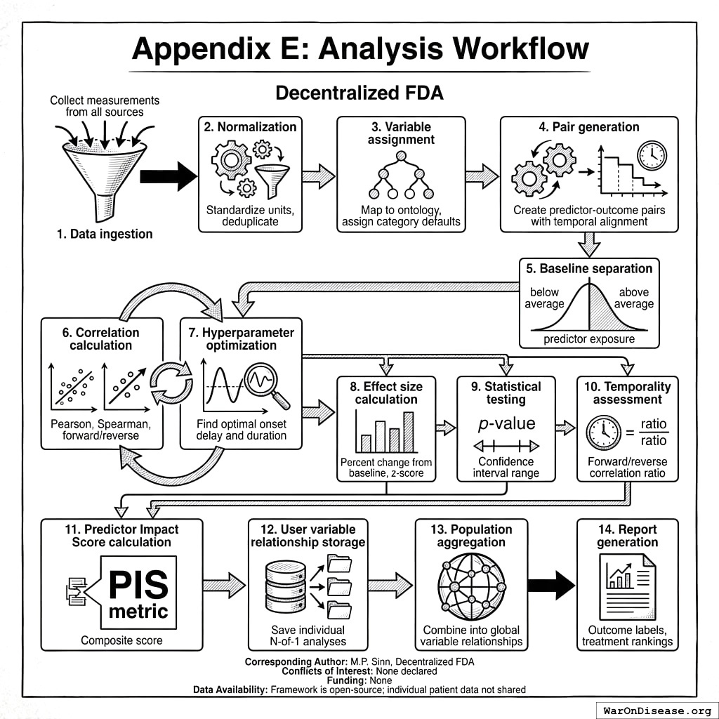
- Data ingestion: Collect measurements from all sources
- Normalization: Standardize units, deduplicate
- Variable assignment: Map to ontology, assign category defaults
- Pair generation: Create predictor-outcome pairs with temporal alignment
- Baseline separation: Partition by below/above average predictor exposure
- Correlation calculation: Pearson, Spearman, forward/reverse
- Hyperparameter optimization: Find optimal onset delay and duration
- Effect size calculation: Percent change from baseline, z-score
- Statistical testing: p-value, confidence intervals
- Temporality assessment: Forward/reverse correlation ratio
- Predictor Impact Score calculation: Composite PIS metric
- User variable relationship storage: Save individual N-of-1 analyses
- Population aggregation: Combine into global variable relationships
- Report generation: Outcome labels, treatment rankings
decentralized FDA
Corresponding Author: M.P. Sinn, Institute for Accelerated Medicine Conflicts of Interest: None declared Funding: None Data Availability: Framework is open-source; individual patient data not shared